1 free read left. Create a free account for unlimited reading + AI research.
Create free accountWhitepaper DiGRA
1 free read left. Create a free account for unlimited reading + AI research.
Create free accountWhitepaperDiGRA
Zammitto argues that game designers should apply colour with conscious intent. The paper presents this as a framework rather than a single correct palette.
Zammitto's paper, presented at the DiGRA 2005 conference, examines how colour communicates meaning in digital games and argues that game designers should use colour deliberately rather than intuitively. It begins with the physiology and perception of colour, covering cones and rods, the hue, brightness, and saturation parameters, and the prevalence of colour-vision deficiency, which affects roughly one in twelve men and matters given that most players are male. The author then proposes that colour meanings draw on three overlapping layers: innate, personal, and cultural. A reference table catalogues widely shared associations for colours such as black, blue, red, and yellow, while noting cultural variations like red as a bridal colour in China and white in Western weddings.
The core analytical contribution applies these associations to game design across several domains. The author examines character design in titles such as Hitman 2: Silent Assassin and Half-Life, where black, red, and grey costuming is read as signalling formality, danger, or neutrality. Interface colour is discussed through StarCraft's race-specific command panels, faction indicator circles in Baldur's Gate, and the red and blue bottles of Diablo II. Environmental palettes are contrasted, with saturated worlds such as The Neverhood set against desaturated ones such as Silent Hill 4, and the author notes that tonal choices sometimes conflict with gameplay, as in Grand Theft Auto: San Andreas.
The paper's method is qualitative and interpretive rather than empirical: it relies on a literature review across perception, psychology, and colour theory, supported by illustrative screenshots and the author's own readings of individual games. It does not report survey data or controlled studies of player responses, so its claims about emotional effects are largely drawn from prior research rather than tested within games. The conclusion asserts that a conscious use of colour would improve immersion, information conveyance, and interface intuitiveness, though it acknowledges there is no single correct palette and offers the work primarily as a framework for designers to consider the connotations colours carry.
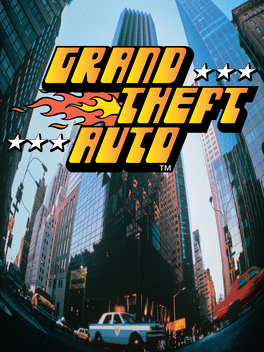 Grand Theft AutoGame · DMA Design · 1997 · 500 documents
 DiabloGame · Blizzard North · 1996 · 157 documents
 Baldur's GateGame · BioWare · 1998 · 84 documents
 StarCraftGame · Blizzard Entertainment · 1998 · 74 documents
 Silent HillGame · Team Silent · 1999 · 56 documents
 Half-LifeGame · Valve · 1998 · 37 documents
 HitmanGame · IO Interactive · 2016 · 37 documents
 Grand Theft Auto: San AndreasGame · Rockstar North · 2004 · 16 documents
 Diablo IIGame · Blizzard North · 2000 · 7 documents
Each row is a game or company this document names, each column a document, oldest first. A mark means that document names it. Select a row to see those documents.
DiGRA · 2016
DiGRA · 2016
Two & a Half Gamers · 2026