Key insights
4 slides
The problem
A single-line menu slows echo selection as inventory grows.
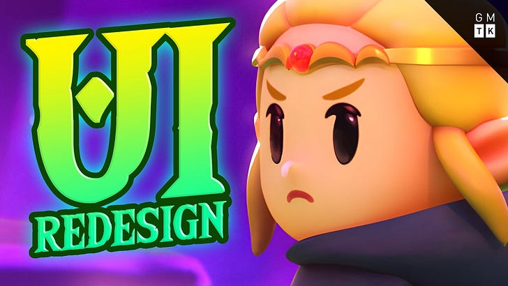
The Legend of Zelda: Echoes of Wisdom uses a single-line horizontal menu. As the inventory of echoes expands, this linear navigation becomes increasingly cumbersome.
What changed
Unity recreations show alternative layouts offer faster navigation.
Recreating the interface in Unity reveals that alternative structures offer vastly superior navigation speeds. These include categorized vertical sub-menus, grid-based layouts, radial menus, and spiral staircase systems.
Speed. Alternative layouts like grid-based, radial, or categorized vertical menus provide objectively faster navigation and better organizational clarity.
The trade-off
The original menu forces slow browsing to encourage experimentation.
The horizontal menu serves a specific purpose: it forces players to browse slowly. This encourages the use of a wider variety of echoes rather than relying solely on a few optimized favorites.
The takeaway
UI design balances technical usability with intended player experience.
Technical solutions can resolve navigation bottlenecks, but the original interface functions as a deliberate constraint. UI design is rarely a matter of objective improvement but rather a balancing act between accessibility and the intended player experience.
1 / 4
Ask AI about this report




Comments