Illustrating Tamriel: Creating Key Art for The Elder Scrolls Online
23 Apr 202159 min video
Transcript
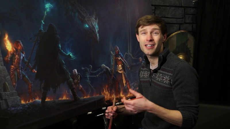
[Music] my name is lucas sliminski and i'm a senior concept artist for zenimax online studios um hold on one second i jumped the gun on myself here okay here we go okay yeah i'm senior concept artist for zmx online studios where my main responsibility is producing key art illustrations for the elder scrolls online and just to give you a bit of background on myself before we get started i originally went to college for illustration at syracuse university in upstate new york a lot of syracuse fans next door uh and although syracuse is a great school their traditional media curriculum didn't really prepare me for a career as a concept artist which had always been my primary career goal so after syracuse i decided to go to grad school at the savannah college of
art and design where i focused more specifically on 3d art for games and shortly after graduating from scad i was hired at turbine in boston where i worked on the lord of the rings online and a short-lived dc comics moba called infinite crisis and then in 2015 i moved to baltimore to work for xenomax online studios where i've been painting the key art illustrations for the elder scrolls online ever since and i imagine a lot of you are familiar with the game but in case you're not i'm just going to give a bit of background on the elder scrolls online or eso for short our game is an mmo set in the elder scrolls universe taking place about a thousand years before the events of skyrim but unlike preceding elder scrolls titles eso is not developed by bethesda but by one of its sister companies zenimax online studios or as we call it on the dev team zas the game launched on pc in 2014 and on xbox and playstation in 2015 it currently has around a million
monthly active players and we continue to support that player population with a regular release cadence of four major content updates per year and as part of the marketing campaign for each update zos tasks me with producing a highly detailed hand-painted digital illustration in-house and of course that's what we're here to talk about so my goal for today is to give you a peek behind the curtain exhaust showing the process i use to create these illustrations and the various completing and competing influences other than me that ultimately shape the outcome of the final artwork so more specifically first i'm going to try to clarify exactly what i mean when i refer to key art for eso plus how it's used to support the game and the main parameters we use to evaluate the success of completed marketing illustrations from there i'm going to show some examples of how i try to balance the sometimes contradictory demands of the various parties that have a stake in the key art and once we understand how they serve to limit my options when designing compositions i'm going to dig really deep into the details of some
of the strategies that i use for visually crafting narrative within single image illustrations and then finally i'll try to show how i put all those ideas into practice by walking through the full production process for one of my completed illustrations it's an ambitious itinerary and we're already on the clock so let's get started key art is a term that can mean a lot of different things in different contexts so rather than get stuck in the weeds on terminology i wanted to find key arts solely according to the way we use the term on eso when we talk about key art exhaust we're specifically referring to the illustrations that we use to market new content releases for the elder scrolls online they're single images intended to be the primary visual representation of the content release they each accompany so basically you can think of key art as the rough equivalent of box art but for a digital game the key art is featured on the eso website and gets used in ad banners across the internet and they're also released as desktop backgrounds and promotional posters at conventions and other
fan events and just to be clear i should mention that the marketing campaign for eso's big annual expansion in the second quarter of each year also includes a cinematic trailer a logo refresh and a cg key art banner which are all built using cg 3d assets all that stuff is outsourced to creative agencies which means i'm not involved in their production so for the purposes of this presentation i'm not going to be including any of these within our definition of key art and we're just going to be pretending that these things don't even exist okay so this is what the key art production process looks like at the broadest level we start with two to three weeks of planning and development where i research the story and iterate on several rounds of comps short for compositional sketches before getting the green light to go ahead with a particular composition i then move on to the main production phase in earnest which usually takes about six weeks so the whole process takes about eight weeks in total which is a really long time spend working on a single illustration and nobody knows that more than i do
however my art director prefers that i focus on realism and detail rather than speed and he likes me to take a constructive approach to figure production and because of the variety of potential use cases or the key art i also painted at a very high resolution which allows for smaller areas to be repurposed for different uses in the future and all of these things contribute to a longer production time frame and since sauce invests so much into these images and they feature so prominently in the way the game is presented to the public the key art sits at the intersection of various competing interests and the stakeholders for those interests each get varying degrees of input into its development so traditionally it's more typical for a studio to outsource the production of marketing assets like key art to a freelance illustrator or creative agency and the discrete nature of that vendor client relationship forces all revision requests through a single point of contact usually represented by a marketing art
director who is typically not the same person that's in charge of the in-house game dev art team but because i produce the key art in-house as a member of the development team our art director at zos is able to exert a much more direct influence over the final look of the key art which tends to result in the illustrations more effectively intimating that same character and tone that's shared by the rest of our game's content but it also means that i'm more directly confronted by the needs of different stakeholders than i would be under the traditional freelance model so let's diagram those stakeholders and my relationship to them as the illustrator i sit in the center of this diagram and the eso art director represents my primary source of critique and feedback but he's only one of several members of management to get a say in which of my comps is approved for production i call this group the executive team and it includes zasa's studio director the general manager and finally the elder scrolls brand manager who works at bethesda and represents their marketing department each member of the executive
team has de facto veto power over any of my compositions my art director insulates me from direct communication with the other executives as much as possible so that he represents the single source of directorial feedback for me now in one sense this is really helpful because i'm not faced with the challenge of reconciling contradictory requests after submitting each round of sketches but on the other hand when my art director has to relay feedback on behalf of the other executives it can sometimes be tough to determine the essence of the original critique that i really need to respond to it also makes it impossible for me to advocate for my own concerns directly so i have to rely solely on my art director's impulse to push back against decisions that i might not agree with i also get content related input from the eso loremaster and yes that is his actual job title and he ensures that nothing i'm included in the illustration contradicts rules previously established in other parts of the elder scrolls universe so while the left side of this diagram is full of stakeholders telling me
what the key art needs to look like the right side will represent downstream dependencies for the key art and none of the stakeholders on this site have directorial oversight over my work but they do each need me to hit particular benchmarks to facilitate their own uses for the artwork so the creative services team needs the key are to conform to specific technical parameters so that they can process it for various use cases before handing it off to the web team which publishes it on the eso website along with promotional copy written by eso community managers who use the key art to help frame the focus of their content while also sharing the key art in social media posts meanwhile my producer manages and enforces my deadline in concert with the lead concept artist who really functions as my my manager and helps to facilitate my interactions with the other teams so with all of these parties involved my task in creating key art sadly isn't as simple as just painting a pretty picture in fact in addition to the technical specs required by the key arts eventual use
the the content of what i paint is more broadly guided by a series of persistent marketing goals and we use these as parameters to gauge the success of proposed sketches and they greatly influence how and why i arrive at my final compositions so here they are first off the primary purpose of the key art is to generate player excitement for new content updates and of course we want to attract players that would be interested in playing the type of game work actually made so it's important that the key art help establish expectations for the specific gameplay experience we're offering eso is not a horror game or a comedy it's a social dungeon questing rpg and the key art needs to convey a tone of adventure and meaningful character interaction that's representative of what players will experience when they log in and of course the keyguard needs to highlight the new features and setting of the content update that it accompanies this seems obvious but it does have more detailed implications like decisions to clothe the characters in newly created armor and outfits to reflect the gear that players will be able to collect in the accompanying update
eso is also extremely story driven and the key art needs to reflect that by being focused on narrative as well this is a major point of emphasis for my art director he's always pushing me to inject as much narrative as possible into the key art and as we'll see that heavily influences the content of the compositions that i develop and then finally another important requirement is that our key art feature emotionally resonant player characters emphasis on the player character part bethesda's marketing department insists that the key art for eso include figures that the player can imagine themselves inhabiting based on the type of experiences offered to them by the gameplay that means that i can't just depict off-screen story moments occurring between npcs a figure representing the player must always be involved in the action and that demand introduces a whole host of complications that require creative solutions and we'll be talking about that more in just a minute now with all that in mind you can see how planning one of these illustrations is an exercise in problem solving
luckily the demands that i'm talking about rarely contradict one another outright however they rarely all serve in the best interest of achieving an elegant composition which is my primary concern so the struggle for me becomes finding my way to an aesthetically competent visual solution while also accommodating external requests that severely handicap my ability to do that and to demonstrate how this works in practice what i want to do now is highlight three specific challenges that i come up against pretty frequently and which have a significant impact on how these illustrations tend to turn out and to make it easier to distinguish between them i'm giving them each a catchy name so we have the mandate the black ball and the chimera i'm going to explain each of these one by one and show examples of how they impact my work so we'll talk about the mandate first and it's basically my shorthand to refer to that last parameter i mentioned earlier where i'm required to include player characters in every key art illustration that i produce this tends to be extremely problematic both compositionally and narratively because if you're going to put an extra
character in a scene that character needs to have a reason to be there he has to have an important role because we don't want to give the impression that our players are essentially spectators to the action additionally player characters are deliberately conceived of as blank canvases onto which players can imprint their own stories so there's nothing specifically unique about raw player characters identities or backstories that enables viewers to engage with them and that means that the relevance to the illustrations narrative has to be derived performatively that is they have to be doing something unfortunately as with any game type there's a limit to the types of activities players can actually participate in while playing in mmo some of which i've listed here and we could depict scenes of players engaging in these activities but that would violate some of the other items on our list of goals and parameters right so for instance as a rule available player activities remain the same for each update but key art is supposed to be focused on new content so i can't just do like a crafting illustration or a phishing illustration and call it key art there's nothing exciting about that and
in part that's because those activities don't lend themselves to a compelling narrative and our key art is supposed to be fundamentally focused on the main narrative of an update the activities that i listed in the last slide may represent ways that the players experience new story content but they don't represent the unique appeal of that content and that's something that the key art is supposed to do furthermore the activity depicted in the key art can't be so specific to an individual quest that it ignores the larger role-playing theme of the update now when new systems are introduced in an update things get a lot easier for me for example when we launch a new guild that players can join then we can specifically depict players engaging in the activity defining that guild so the thieves guild is obviously a fraternity of thieves and so the key art for our thieves guild update could logically focus on player characters committing a heist likewise the dark brotherhood is a group of assassins and so the key art for that update naturally depicted player characters performing an assassination similarly our morrowind expansion
included the new warden player class so we had an obvious opportunity to showcase player characters utilizing the new classes skill line and then finally our homestead update introduced a new player housing system so an ideal solution was to show player characters inhabiting a private home these pieces fulfilled the new content and main narrative parameters because they each more or less represented the marketing focus of the update and because they established a new role-playing concept for us to highlight but without a new system to feature the marketing push typically focuses on a new playable zone or dungeon or story based theme and finding ways to meaningfully include player characters in those becomes a real challenge in these cases i have to ask myself the question what's the difference between a player character and an npc visually speaking it's a question that doesn't really have a specific answer for example one of the two compositions you see here was rejected for a lack of player characters in it
which one is it let's go for some audience participation here uh i know these are just unfinished line drawings but raise your hand if you think the one on the left failed to include player characters okay and then raise your hand if you think it was the one on the right all right so people who chose the left were correct but i'm not surprised that the room is torn it's an unfair question because oftentimes the player character designation is only clear if you already understand the backstory of the quest design and that's information that most consumers won't have when they first see the image anyway in short there is no significant visual distinction between a player character and an npc which is kind of the point so what's the executive team's way of identifying player characters in these sketches well in my experience they seem to recognize player characters in key art according to the following parameters they're looking for a cluster of three figures of different races who are typically foreigners to the the location of the new content and preferably outfitted with gear indicative of different player classes
now these parameters have never been explicitly defined for me this is just what i've cleaned over time based on which of my compositions have been rejected and which have been green lighted but the hidden cost of having to accommodate the player character mandate is that it forces me to forsake a lot of great off-screen story moments because there's just no way to inject player characters into them okay that is the mandate um so now let's talk about the black ball which is basically the mandates opposite so the black belt represents the kind of like seemingly random blanket prohibitions that executive stakeholders sometimes place on certain compositional elements one of the more problematic of these is the the directive that i can't show main characters that are turned away from the viewer now that might not seem like a big deal at first and it's certainly an understandable request given that heroic character backs have become something of a trope in marketing imagery and admittedly avoiding the overused examples shown in this shown here is not a bad idea but there are also many cases where it's compositionally and
narratively useful to depict the main character facing away from the viewer and the reason for that has to do with the limitations of single image visual narrative we're going to get deep here okay fundamentally the spatial link between a figure's face and the object of their attention results in two parallel image planes that face one another and it's generally impossible to see the fronts of two surfaces at the same time when they're facing in opposite directions now cinema deals with this by cutting between multiple reverse shots so one shot shows the character's pov while a second shot will show the character's reaction to what we just saw but in keyguard illustration we don't have the luxury of multiple pov shots so often times we're forced to choose between focusing on the character or focusing on what she's looking at and doing the latter typically means we see the characters back instead of her face now while focusing on the character is certainly the primary conduit for evoking emotion in the viewer the character's object of interest is oftentimes more powerful in being narratively informative and why is that well in its simplest
form you can think of narrative as the presentation of cause and effect first there is an inciting incident and then drama emerges from the way the consequences of that incident play out for example if an earthquake causes a tsunami the predictable consequences of death and destruction are likely to follow in character-centric illustration whatever challenge the characters are shown to be confronting is what occupies the role of cause and the character's reaction to it represents the effect as a rule an effect is more easily inferred than it's caused so it's easier for a viewer to guess at what a character's reaction to an incident will be than it is to guess at the situation that was responsible for producing that reaction the viewer needs to see evidence of whatever situation a character is facing in order to understand what's at stake and to sympathize with what they're experiencing so returning to our tsunami example if we want to plan an illustration that conveys the essence of the rudimentary narrative we've set up here and we can only focus on one of these story beats which image should we keep in order to
retain as much of the story as possible i would argue that the first image is more useful consider if we were to take that first image away and only see an image of death and destruction well there are any number of situations that may have led to that result including a tornado a fire or some kind of military action but if we keep only the inciting incident well its resulting consequences are usually much more predictable conversely an illustration that only focuses on a character's reaction to a conflict without showing what that conflict is well that robs us some very powerful storytelling tools and since we want to show both the cause and its effect within a single illustration the problem with the black ball demand is that it requires me to make two facing planes visible to the viewers simultaneously from a single point of view the most straightforward way to do that is to view the scene side on but that forces the composition to be set up like everything is occurring on a theater stage which is pretty boring of course it is
possible to find other solutions to this restriction but the black ball still significantly limits the types of images and stories that i can effectively tackle in eso key art okay so that's the black ball and just to review the mandate forces extra elements into the key art while the black ball restricts the options i have at my disposal to incorporate them gracefully collectively they limit my ability to generate clear concise compositions for new key art which in turn leads to the third major challenge which is the chimera expanding the scope of a composition to accommodate disparate marketing goals this one's the killer the chimera basically refers to efforts to shoehorn extra compositional elements such as player characters into a narrative that wasn't designed to fit them more often than not this comes about when stakeholders propose their own solutions to the problems created by the two preceding challenges and it's by far the biggest source of scope creep i encounter with the key art so as an example let's take a look at the set of comps that i developed for our 2017 third quarter update the horns of the reach
and each comp you see here depicts an off-screen story moment extrapolated from the content of the main quest now while i knowingly omitted player characters from the top two sketches the bottom two were conceived to allow for certain figures to be interpretable as either player characters or npcs in spite of that the executive team preferred this sketch from the top row but since it didn't include player characters they requested that i modify the composition to add them in now that was problematic because the ritual that i'm showing take place here doesn't allow for the player to have any active role in the scene players don't actually participate in or witness this ritual in game it's only mentioned by npcs and player characters just wouldn't make sense within the context of the story that this composition was intended to tell but due to production time constraints and because the stakeholders had already endorsed this composition i had to find a way to fit player characters in there somehow my art director's solution was to expand the image by framing this composition with player characters sneaking up on the ritual in order to stop it from being performed
so that caused the scope of the illustration to expand immensely it also created this strange image within an image effect where the foreground scene of the player characters framing the action that's taking place in the background makes the original scene seem even more vignetted and remote not to mention it more than doubled the total surface area that i had to render and resulted in a lot of after hours and we can work to get this thing completed before the deadline and the real kicker was that for the final ad campaign somebody decided to crop the image back down to my original composition anyway for most social media posts so we're not a fan of that get that out of there there are two relevant takeaways from this example the first is that adding characters dramatically increases production time while my producer tries to accommodate me when the scope of an illustration changes oftentimes the additional work required exceeds the additional time available for me to complete it
so it's in my personal interest to avoid character bloat but more importantly showing more often times doesn't make the composition better in fact it may overcrowd the image complicate the read and make the picture feel too busy now the the image within an image framing device that we ended up that ended up being used in that last example is worth a little more discussion before we move on because it's an idea that gets suggested semi-frequently as a way to stretch a single illustration on eso to include more complex plot elements than it can comfortably hold and to show what i mean let's take a look at the selected sketch for the psijic order key art that i painted for eso's summerset update where we can see all three challenges at play so first the chimera issue is represented by the picture-in-picture effect created by imagery appearing inside a magical holographic vision at the top of the sketch here and that's because in the corresponding content the mages of the sigic order were spatially removed from the events of the main quest line so i was asked to include this floating magical snow globe element as a way of
symbolically representing the threat that the players would face in the main story also the mandate came into play because my original drawing didn't explicitly include player characters so my art director requested that i restructure the composition to fit a trio of player characters into a horizontal crop format and finally the black ball restricted the options available to me to do to make those changes because i couldn't position foreground characters with the backs turned toward the viewer so adding the triad of player characters created a very unbalanced image composition so i was able to successfully argue to get one of those player characters removed and the final composition ended up being reasonably effective with the exception of the picture-in-picture motif represented in the center it's difficult to parse exactly what it is that we're seeing inside that magical sphere and the fact that it's meaning can only be understood symbolically doesn't do the narrative any favors it was a struggle for me to even get the illustration to this level of readability and since i've used it as a caution and since then i've used it as a cautionary example to dissuade similar
suggestions for more image within an image compositions okay so now that we've covered the major challenges that they might limit my options when conceptualizing the key art i want to show some of the tools that i rely on to maximize the narrative impact of an illustration without overloading and breaking it as a case study i'm going to walk to briefly walk through the development process of the key art i created for eso's dragon bones update which i painted back in december of 2017 and which was released the following march and as we'll see most of the creative work for the key art is front loaded to the earlier stages while the actual production and rendering of the image is a rather mechanical exercise so the whole process starts with an initial brief from my art director which essentially amounts to a really basic overview of the new content along with his ideas for particular story moments or important visual elements that he thinks we should highlight in the key art as i mentioned one of the things my art director really likes to emphasize is a
narrative focus for each illustration we do it's important to him that each image tells its own story now the dragon bones update was a dungeon pack which in the cadence of the eso release schedule tends to mean that it's relatively thin on story but the basic gist of it was that a necromancer had discovered the bones of an ancient dragon which he intended to reanimate and use it to kill all of his enemies the player's goal is to stop him and in doing so collect cool loot so maybe not super original when viewed at a high level but it's definitely enough to get us started so after talking with my art director i do some more research on my own which includes reading the design documents generated by the content designers looking through the concept dart that's been done for the update and depending on whether it's been built yet i fly through the play space to get a feel for the environments that players will encounter while playing what do those story elements that i mentioned determined for the key art well right away i knew that this key art was obviously going to have to showcase a reanimated dragon skeleton
it was the central focus of the dungeon pack and you can't call something dragon bones and then ignore those bones in the marketing campaign also since it's unusual even in tamriel for a dragon's bones to come back to life i knew that it would be important to show the player characters shock and surprise at encountering a giant living skeleton i also needed to provide some explanation of how or why the dragon skeleton has become reanimated which meant i needed to create a visual link between the necromancer and the dragon so the viewer understands the causal connection between them and then finally in order to convey the enormity of the threat the dragon poses to our heroes it would be helpful to emphasize the scale of the dragon compared to the size of the human characters so with those queues jumping off point i started doing some very rough thumbnail sketches and you can see how these are all really built on the elements that i just talked about especially like the scale difference between the necromancer and the dragon and the player character's reaction to seeing it the sketch in the lower left hand corner had the most developed narratives so i started flushing that one out first
as we discussed a major storytelling constraint of key art illustration is that we could find telling our story within a single image and that makes it difficult to convey multiple story beats that take place over time one of the ways that i sidestep that issue is by using different characters to represent different beats or moments in time a successful reading of the image is therefore dependent upon constructing the composition so that the viewer's eye notices each of these story beats in the order we want and we can see that playing out in this first comp here so the initial read in this composition is clearly the necromancer silhouetted in front of the dragon skeleton and based on his pose we get the sense that he seems to be casting some sort of spell on the bones next we notice the figure in the center foreground who appears to be sneaking up behind the necromancer with the sword drawn along with that figure we also pick up on the foreground figure on the left who's urgently gesturing towards something on the right side of the image and that carries our eyes to the figure on the right who seems to be startled by a light glowing from the eye of the sock the eye socket of the dragon's skull
we also realize that the central foreground figure seems unaware of the glowing eye lights suggesting that they've only recently begun glowing sometime after he took up his current position now of course when we first look at the image our minds take all this in within a second or two but the order that we notice this stuff influences our ability to easily grasp a story and learning how to direct a viewer's eyes to move through a composition is an important aspect of storytelling through illustration the artist has a number of tools at their disposal for directing the viewers gaze and this isn't really the focus of today's discussion so i'm not going to go into detail with these but by playing with relationships between lightness color scale and proximity to the viewer the artist can establish lines of action along the edges of major shapes which is what guides the viewer's eyes through the composition and there's one other important composition planning tool that i think frequently gets overlooked and that is that in the west we're taught from an early age to process visual data by reading from top to bottom and left to right that means that when a viewer approaches a work of art for the first time their eyes will automatically seek to enter
the image from the upper left corner by default so it's important to take this into account when planning for viewer eye movement because it gives you a reliable start point where the viewer will enter the maze of your illustration and just as importantly if your goal is to have the viewer's eye first enter the image at a different location then you have to build in a lot of extra visual cues to counteract that top left corner bias so with that in mind when we refer back to our dragon bone sketch we see that i'm using the dragon's upper arm bone like a highway to lead the eye in from the upper left directly into the center of the image from there our eyes will continue to move around the composition following lines of action created by other major shapes our eyes naturally stop to rest at any location where one line of action ends and another begins and these areas thus become the focal points of the image and the location of different story beats so after taking in the necromancer the bright high contrast line created by the dragon's nose channels our eyes down to the character in front where the angle of the sword in the direction of his body that his body is facing swings our focus back to the left encouraging us to
engage with the figure position there next your eyes pick back up on the high contrast edge created by the rim lighting of the dragon's forearm and continues from left to right along the upper arm and spinal column now arcing our focus over the top of the image like this is an important step but you could also say it's a dangerous one insofar as there's any danger in illustration because in tracking along the strong rightward descending shape of the dragon's spine i'm reinforcing our eyes predisposition to move from left to right and the risk is that the viewer's attention could drop right off the edge of the image which is obviously not what we want so that's why it's important to build interesting shapes like the dragon's horn and the rim lighting along the figure's outstretched arm which provide a directional counter force to bring our focus back toward the center of the image and at this point we see that we've established a circuit of visual interest which invites the viewer to retread the moments of the story in a clockwise fashion and in so doing encourages them to spend longer engaging with the artwork and when you spend as much time painting these images as i do you definitely want to squeeze every second of your engagement that you can out of them
so not to belabor the point but quickly going back through that narrative sequentially this is the full story that we'd be trying to tell if we had more than one image available to do it right the necromancer begins casting a spell on the bones our heroes will sneak into position near the skull the dragon's eyes light up some of the heroes notice the eye lights and react and then finally dragon wakes up and our heroes become overmatched unfortunately we only have one image at our disposal to tell the story and technically this snapshot has to occur at a single moment in time so i'd say that uh what we're seeing in this comp is taking place right about here somewhere between beats three and four but of course the first four beats are all represented to some extent in the comp even though some have already occurred because the storybeat of the glowing eyelights is the last stop on the viewers guided tour through the composition our eyes interpret it as having occurred more recently than the other beats in the image even though everything is ostensibly occurring at the same moment in time but based on the way i've structured the composition i'm providing clues to what has happened in the scene just before the moment we're witnessing
and giving the viewer hints of what is likely to happen in the moments to follow so in this case the dragon is going to wake up and these guys are going to be in trouble this way i'm establishing a story with a beginning a middle and an end all within just one image now the feedback that i got from my art director on this sketch was that he wanted the player characters to have more to do than just sneak up on the bad guy and this is yet another example of the problem created by the player character mandate searching for solutions to that problem led me to this composition here which shows our quest party attempting to steal loot from a dungeon obviously the dragon is the first major read here but the critical element of this story is our heroes ignorance of the danger they're in so like this guy is so focused on breaking into the vault that he's oblivious to the massive reanimated skull position right above him the lookout on the right thinks he might have heard something but he's looking in the wrong direction while the coiled posture of the figure holding the pickaxe tells us that he's just clued into the real danger from above and then over on the left we have a confrontation going down between one of our heroes and the necromancer who's being held at sword point
it's clear that our questing party believe they have the situation under control but the necromancer's glowing staff indicates that he's magically controlling the as yet unnoticed dragon so he's not as helpless as he looks now the main storytelling problem with this composition is that the necromancer isn't prominent enough in the image using the eye movement analysis we talked about before the necromancer is one of the last reads and the nature of the relationship between him and the dragon isn't very clear so to try to solve that problem i kept the same stage but repositioned the actors to see some control back to the necromancer so now he's the one in the position of power above our heroes and notice that the player characters each have different levels of awareness of the dangers facing them so like the guy closest to the necromancer still clueless while two others are spot with the spell casting necromancer but the lookout in the foreground is the only one who's noticed the dragon might be waking up which we're again indicating by the eyelights in the skull and by using the same color for the light in the dragon's eyes and the necromancer's magic we could really underscore the idea that the necromancer is the one in control
here now as i mentioned the narrative i'm constructing for each of these composition compositions involves at least some of the characters being unaware of the threat posed by the dragon this is another technique that i lean on to expand the narrative weight that can be carried by a single image because when the viewer knows something that the characters don't it creates a tension that anticipates the character's discovery of the information the viewer already has and this allows me to indicate character in his intentions and expectations prior to a watershed moment while simultaneously enabling the viewer to infer how the character's emotions will change in response to this moment of recognition so essentially what we're talking about is a plot reversal captured within a single image so in this next composition and this is the last one i promise i distilled that idea down even further i got rid of the treasure hunter subplot and replaced it with a direct confrontation between the necromancer and our player characters who seemingly have him cornered but the necromancer is smiling deviously in spite of his predicament because he knows he's about to get some major
backup in the form of the fog shrouded dragon he's summoning to protect him like the other comps this one includes one of the player characters depicted in the exact moment that they realize the dragon is awake in this case it's the figure furthest to the right so this is basically a pictorial form of anagnorisis which refers to the moment in a story when a character makes a critical discovery that changes the stakes emotionally including the story be those two things first it adds an immediacy to the danger because clearly the guy on the right is about to alert his friends and everything is going to change and second it also makes it clear that the dragon is indeed a threat otherwise it's possible that all these guys could just be ignoring the dragon for some reason thereby undercutting his narrative significance or perhaps the viewer could misinterpret the dragon is actually being allied with the player characters the character experiencing anagnorisis tells us that his reaction is the same
one that everybody else would be having if only they saw what he was seeing it's a useful tool for clarifying character intent in complex compositions and expanding the dramatic tension of a scene in any case my art director liked this image but he wanted it to have more story beats and to make it seem like our party of adventurers already had their hands full with other threats before the dragon even enters the ring so basically he wanted to raise the stakes so i added in some reanimated human skeletons for our adventures to fight off which also allowed me to promote the foreground figure on the left to our hero character still poised to confront the necromancer directly while his buddies take out the skeletons behind him and then finally my art director felt that we needed more indications of the location setting for this scene so i added in some architectural pillars to imply that we were in a massive subterranean ruin with four potential options at this point i did a color toning pass on each comp because while a composition may look great as a line drawing when you introduce value and color the readability and focal points of the image can change greatly so it's
important to block all this stuff in early on so that i can catch any major problems before we invest too much time into a flawed composition at this stage uh the color tony mostly breaks down into warm and cool color influences meant to reinforce narrative cues like the relationship between the dragon and the necromancer as indicated by the same cool glow to their magic effects nevertheless everything at this stage is still just placeholder and i typically end up redoing the line drawing the grayscale values and the colors once a specific composition has been chosen but once i complete the rough toning pass my art director submits the options to the executive stakeholders and then the other executives reply with questions comments and concerns about various sketches and their consensus opinion results in one of three possible verdicts so first they may reject all of the comps outright uh in which case i needed to determine what it is about those options that i provided that's not working for them so i can do a brand new
round of sketches that will hopefully be more successful and this iterative back and forth process can produce as many as three rounds of unique comps before one sketch is finally approved and approval is the second possible outcome but more often than not they deliver a third verdict which is a provisional approval and basically this means that they like one of the comps but they want me to make some changes to it before i start full-on production so for the dragon bones key art we're looking at today they did end up green lighting the last of the four compositions i developed although that's not always the case so even though we had the green light to go ahead with production on this composition we still wanted to refine some image elements a bit before i dove into detailed rendering work one thing i wanted to do was introduce a warm light into the scene to contrast the cool shafts of moonlight coming in from above and so in order to justify that light source i changed the pose of the figure on the far right and put a torch in his hand and even though it isn't represented here yet we also decided to add
flames scattered across the ground between the necromancer and the front warrior which would add a warm fill light to pop that front warrior off the cool background behind him and also create a symbolic separation between the two characters i also tried out a couple different poses for the necromancer and we ultimately settled on this one because by dropping his left arm like this we create some additional space in the image for the dragon's head which you want to establish as a focal point and it also opens the space between the necromancer and the front figure here so we can we can imagine that their eyes are locked on one another reinforcing the story beat of the confrontation between them now you might have noticed that throughout this entire sketching process the figures i've been drawing are all semi-naked bald dudes has anybody noticed that that's because in the early stages it's simpler to sketch a generic human form to indicate the position of shapes and volumes rather than allow myself to get caught up in trying to capture specific details and it's also because even this early on in the painting i'm using photo reference of myself
to inform the poses for the characters and you can see some of those references here and there are a couple of benefits to using myself as a reference model and the most important of these is that i have some idea of the mood that i want to convey in the pose so i can kind of become that character myself without having to direct a model who has no idea how their pose fits into the image of the story of the illustration but i think the main point here is that having adequate reference is absolutely essential to producing high quality key art and i would argue many art and i lean i reference heavily throughout the entire painting process any day that i find i'm really struggling with what i'm doing i realize it's because i don't have good reference and then i have to go search it for it or create it myself and then things get moving again so although all the figures look vaguely like me at the beginning we obviously want to represent a more diverse cast of characters in the final painting there are nine playable character races and two genders in eso and at this stage we decide on race and gender assignments for each figure in the painting
of course some of this is defined by the narrative like if i'm depicting specific npcs or if the scene is intended to take place in an area of tamriel where a specific ethnicity is dominant in the population there we also want to represent at least one of the beast races since they're a signature part of the elder scrolls series and in the interest of representation when the narrative allows for it i also try to represent a diversity of races from the real world as well as a mix of male and female characters more generally i just want to say that i believe that as artists we have a responsibility to be sensitive to cultural representation in our work and be responsible to prevailing cultural climates which in turn our work helps to influence on the one hand it's so weird to think that my paintings of a fantasy medieval society have any relevance to contemporary culture at all but the truth is whether i intend it or not every painting i produce makes a statement about how i personally view the world around me and each painting also contributes to a cultivation of imagery that collectively shapes the way our players view the world too
and i'll give you just one example of how this has been relevant in my own illustrations so the second piece that i worked on after starting exhaust was for eso's thieves guild update the update takes place in the province of hammerfell which is the home of a primarily dark-skinned people called the red guards and it was therefore natural that characters with darker skin tones would feature prominently in our key art but the composition that developed during the sketching process depicted a lone member of the thieves guild evading city guards after pulling off a heist i was working on this illustration in the months following the freddie gray protest in baltimore and it occurred to me that it might not be the right cultural moment to showcase a black man being chased by law enforcement on the other hand however populating the image with white characters in an in an in-game location known to have a light-skinned minority seemed inescapably like marginalization so i voiced this concern and i even sketched out some alternative racial treatments for the primary character but initially the executive team was focused on establishing continuity with the main character that had been depicted in an earlier illustration for
the same update so i continued with production with the character cast as a red guard and the image actually got fairly far into production before the decision was finally made to recast our hero thief as a khajiit instead which is the version of the that was eventually released to the public now if we'd gone ahead with the original red guard character we may never have been called on it the connection might not have resonated in the way that i feared but the point is that with every decision you make in a painting it has the potential to make a specific statement to your audience whether you intend that statement or not so the most responsible approach is to be deliberate and circumspect with every choice you make in your art in order to avoid inadvertently making statements that you or your company might not intend anyway getting back to the dragon bones key art once the race and gender selections are chosen and approved i start the linework stage of production where i go through each figure and modify the anatomy to match the body type of the race and gender intended for each character i also draw
clothing armor and gear on top of the anatomy drawings and i tend to design the gear using inspiration from in-game armor sets which i combine with influences from photo references to inject more personality into the character's outfits and with the line work stage complete it's finally time to start painting so as i mentioned before most of the creative work for the key art is front loaded and honestly by the time i'm done with the drawing stage most of the important creative decisions have already been decided on my topic for today is not intended to focus on technique but in the interest of being thorough and to give the session a satisfying conclusion i just like to quickly walk through the remaining stages of my process so we can see how this painting finished up now after the line drawing my next step is to establish diffuse color values for the characters so i use the lasso tool in photoshop to create selections of each material represented on each character and then on individual layers i fill
each selection with a unique color so for example the skin will be on one layer the leather armor will be on another layer the metal trim will be on another and so on and the real value of this step is that it allows me to control click the layer thumbnail of each material to restore the corresponding selection whenever i want so i can use them to define masks for adjustment layers later on moving on from there i render the lighting information in the scene in grayscale before introducing the color bias of each light source and then finally combining all of this with the diffuse material colors i established earlier to achieve a rough approximation of the colored and toned lighting environment for the scene now everything i've done to this point has really just served to establish an under painting that i can use to start painting on top of but now i can finally start the direct painting stage which makes up the bulk of the rest of the process so this is where i finally lose the drawing i reduce the opacity of the line work layer and then begin painting in new layers on top of that my process tends to involve a lot of adjustment layers which i prefer to keep live so that i can revise them later on
if necessary and the downside to this approach is that it eats up a ton of memory so eventually i end up using breakout psds to work on each character individually in separate documents i focus on the characters one by one treating each as its own mini painting before reincorporating them into the larger composition and in this case the dragon counts as a character too so once i'm done with the characters i focus on the surrounding environment building in some features from scratch and also incorporating some in-game screenshots in the background that get heavily painted over to save on painting time a lot of surface texture is generated through a combination of noisy brushes and photo texture overlays and then in the later stages of the painting i also do a final dirt and grime pass to help things feel convincingly aged and lived in i add in cast shadows for the characters and special effects before doing a final color grading pass which is often one of the most important steps of the entire process this is where i finally establish a
cohesive atmosphere for the illustration and rebalance the lighting and colors to increase readability and emphasize compositional elements in a way that better supports the narrative and that is basically it aside from cleaning up the layer groups to help the marketing web guys more easily navigate the file i pass it on for publication and then the whole process starts all over again for the next one so that is uh that is the end of what i had prepared for today [Music] so i just want to thank everybody for coming i hope you found it worthwhile and i will be glad to take any questions that anybody might have first of all i have uh no experience as an artist but that's that's that's so much better this is incredibly insightful i had no idea see if you're not an artist you can't
tell me that i'm wrong about everything i just said so well yeah it's the composition anyway sorry i've noticed two things there there's actually questions i i hope this doesn't come off the wrong way but uh in the initial sketches that you were um giving you have these these concepts of like the black ball and the mandate but you still didn't include characters in those initial sketches that's just something from like your own point of passion that you're trying to like be like hey look this is good i need to see more of this so that you can get it or is that something that you've now scrapped in your design process yeah that's a good question i'm glad you asked it because it's something that i knew i had left out of this presentation his question is why do i keep offering up sketches that don't include player characters from the beginning if i if it just creates problems for me later down down the road and part of that is because the part of it is because i've we're doing this for three and a half years and over that length of time we've had different um we've had different uh brand managers
come in and out of the project on the bethesda side and so they have different preferences and so the concept of what defines a player character and how important that is has shifted over time the other thing too is that because you know i mentioned three of those challenges but there are a lot more that i you know weren't as important to talk about but you know one of them is that there are oftentimes specific angles on the story content that they're trying to push and a lot of the time like the two things contradict each other so you can't tell those stories and also have player characters there that are doing something important and so my initial my initial solution is always to say look we can do it this way and then but there's this hard and fast rule that they typically come back to so so that's why um yeah so and so in some ways it's like a springboard for them to give you alternate feedback is that yeah i mean that's fair yeah i think so um i know that i'm not supposed to ask follow-up questions but there's no sword or there's only swords like how come
nobody has anything but swords i'm like looking at all this being like is is that a hammer not a sword well so a lot of what i sh i think there are uh she says there's no repeating the question he says are only swords and why aren't we using other weapons i think there are examples of other weapons in some of the key yard um the specific one that i broke down um it just worked out that way yeah i don't know good answer in a lot of the other sketches though i'll typically just use a sword as like a like a stand-in weapon and then typically i will end up modifying the pose once it gets approved to a like a more specific weapon um because it doesn't make sense to bother with that kind of detail if the sketch is going to be thrown away anyway so well thank you so much thank you thanks all right great talk great work great project um my question was in regard to getting started with your composition i always find that the most difficult part of composition is getting started because when you get started it's not a composition yet right it's a subject or it's a frame um and if my question was going to be do you start
with a subject or do you start with a frame and it looked like in the breakdown of those really simple sketches of the dragon you were really focusing on the subject and not quite yet considering what the frame because there was no outline on those sketches that is true and uh so yeah i mean i think the way i just work naturally i will use do i start with a subject or a frame when i'm when i'm first beginning the compositions am i worried about how all those elements will fit inside a particular crop format the answer is no typically just the way i work i will start by drawing just a character on like a massive pst that doesn't have any bounds to it really and see where it takes me and one of the reasons for that in this case is because the the key art that we make and i left this out of the talk but there are a lot of actual like format and crop specifications that i have to hit and what that means is that i have to build a lot of margin area into every illustration that we do so oftentimes it i end up painting this you know huge scene of a world that we
only crop in on a small window of um that's actually the illustration i'm working on right now is like that like i've got so much that i'm gonna have to crop in later and stuff outside of that will be wasted work but that's that's just kind of the way it goes and i wanted to say as part of that there is a sort of paralysis in the early phases of doing a concept i'm not sure if you ever feel like you might be getting ahead of those requirements or desirements and whether or not you feel like whoa i can't like there's a pressure to demonstrate that you're making something or that you can make something but also you know that there's stuff out there that's not being expressed yet you don't want to start getting ahead of that so like how do you is there a way in your process to manage that well i think i could take your question a couple different ways but what i would what i would probably say is um i think maybe i would rephrase your question as am i ever concerned that uh that the people who see my artwork internally will make a judgment on the quality of the composition i'm developing before i really get to a point where it's fully been expressed and then the answer
to that is certainly yes but it becomes less so over time because there is like a level of of trust that gets developed and they just they they've seen enough examples they know how it's more likely to turn out and so they gave me the benefit of the doubt so um i don't know who was first you do you want to go over here they always make these mics for tall people so my question it is a technical question so sorry but i noticed that you had some meshes in some of your sketches and i was wondering if your 3d modeler gave that to you already rigged and you just put it in the pose you wanted or if they posed it for you or if you did it yourself yeah and i also wanted to know what like you don't have to give me actual time hours worked because i hate it when people ask me a question but i want to know what your timeline in the whole production phase was um well i i mean i would say overall like what way typically gets slated that the entire production is supposed to last about eight weeks
and we and i do i do overshoot that sometimes typically because there will be problems developed or the art director or someone else will make will decide that something's not working and then i need to go back and kind of you know retool the illustration and that adds time um so sometimes it gets pushed but eight eight weeks is what we shoot for in production schedule as to your your other question which was um where do the 3d meshes that you kind of see hints of and some of my sketches come from the answer there is uh it definitely varies so i started my career as a 3d production artist so i certainly have the ability to build those myself and i'll typically do that for environments or you know to build like the structure sometimes i'll do like a really rough gray box scene other times i'll go into zbrush and turn on dynamesh and sculpt like a face or some kind of object that i want to get from a different angle um and then finally uh in the case of what we looked at today that dragon i think is probably what you're talking
about there was um uh there was a really early like uh proxy for the dragon and that i did not make um but that was it already existed um and i just took the maya file or it was a max file but i work in my i took the file and i cannot rig and it was not rigged itself so um so i just basically used pivots and put it in the position i wanted and that is still faster than just trying to like draw anatomy that doesn't really exist anyway so it's you know you don't want to go too far into debating with yourself whether or not it looks right um so yeah awesome thank you so much you're welcome and then over here hi lucas uh thank you for the thought it was really informative and it was really awesome like your paintings are really awesome i think thank you um so just one small question is like when you're doing like these ski paintings how important is for you to do like all the characters like with the guns exactly as they appear in the concept part or exactly the appearing games so you have to leave like so that they are like like uh like faithful representations of
those or are you able to also like change these these concepts to suit the needs of a certain painting right so the question is uh how much flexibility do i have in changing the appearance of the characters or other things for the key art even if they don't match the concept art or the final in-game models the answer is i have a lot of flexibility and it didn't necessarily start out that way but i think that my art director kind of has uh he understands and and firmly believes that the illustration is meant to be an aspirational depiction of what the game is as opposed to a like a realistic one um so i'm allowed to change things make things look hopefully better and higher fidelity than they would in game or in the concept and also um i i'm given a lot of flexibility with what they what the costuming so oftentimes i will use pieces like armor pieces from the game but the thing is about the way that we do armor sets in eso they're it's like it's it's a very compartmentalized modular system and so everything kind of has to look similar it has to be very
form-fitting to the character we don't have we can't have fabric hanging off and things like that and so one of the things that i like to do is just use pieces of that but build kind of something that's more of like a that looks more like a a home-built kit you know things that the character may have found and decided to incorporate into their outfit and uh and yeah and adding different kinds of wear and and fabric hanging and things like that so um yeah i definitely get flexibility uh when it comes to that and it rarely does it get pushed back do i get do i get pushed backwards like no you got to make that look look the same so okay thank you yeah and if that's it thank you guys so much
Auto-generated captions from YouTube — names and numbers may be misheard.
Key insights
7 takeaways · ~3 min read- 01Creating key art for The Elder Scrolls Online is an eight-week process, consisting of two to three weeks of planning and compositional sketching followed by six weeks of production.
- 02Effective key art must distill the core narrative of an update into a single image, avoiding overly specific quest details in favor of broader role-playing themes.
- 03To manage the limitations of single-image storytelling, artists can use 'plot reversals' where the viewer knows more than the characters, creating dramatic tension by depicting characters unaware of an imminent threat.
- 04Compositional flow is critical for viewer engagement; artists should use rim lighting and deliberate shapes to create a 'visual circuit' that encourages the eye to move through the image in a clockwise fashion.
- 05Adding characters to an illustration significantly increases production time and surface area, often leading to wasted effort if the final marketing assets are cropped for specific social media formats.
- 06Early-stage compositional sketches should utilize generic human forms to focus on shape and volume, delaying the addition of specific race, gender, or armor details until the composition is finalized.
- 07Every visual choice, including race and gender selection, carries a specific narrative statement, requiring artists to be deliberate and circumspect to avoid unintended messaging.
Ask AI about this video
Cite this video
Citation
Generating citation…
Comments