1 free read left. Create a free account for unlimited reading + AI research.
Create free account
How Video Games Use Supermarket Psychology - Extra Credits
Key insights
5 takeaways- 01Supermarkets utilize non-linear floor plans to force customers to traverse the entire store, maximizing exposure to non-essential, high-margin items placed at eye level or on end-cap displays.
- 02Retailers and game developers exploit decision fatigue, where rational decision-making shifts to emotional impulses after approximately 23 minutes of engagement and largely ceases after 40 minutes.
- 03Free-to-play games mirror physical retail by using confusing store navigation that forces users to scroll past paid goods, increasing the likelihood of impulse purchases.
- 04Digital environments employ emotional priming through narrative cutscenes and timed rewards to extend play sessions, mirroring how physical stores use sensory cues like bakery aromas to influence consumer behavior.
- 05Developers strategically time special offers to coincide with periods of high player engagement, directly capitalizing on the same psychological vulnerabilities used in brick-and-mortar retail.
Ask AI about this video
Transcript
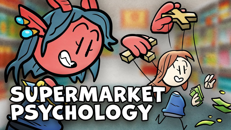
Oh, hey everyone. Say, ever walk into a supermarket and then walk out with something you never planned to buy? Well, that is by design, my friends. And while that doesn't feel terribly awesome to realize, the design behind it is actually pretty dang fascinating and sheds light on how digital design is done today. So, what do you say, Joey? Want to go shopping? I just need to pick up a few things real quick. It's dangerous to go alone, after all. I'll take this and this and this. Thanks so much to Imprint for helping me to learn cool new stuff really fast. One quick caveat up top. For this delicious design discussion, we're going to be focusing on supermarkets in the United States, mainly because A, the US has had supermarkets for the longest, and B, has arguably spent more than any other place in the world refining their design. Okay? Okay. The supermarket couldn't exist until the advent of modern refrigeration and the growth of urbanization. But by the 1930s, we did
have what could be recognizable as a supermarket today. So, supermarkets have been around for about 100 years, continuously being refined and designed for one purpose: to sell you more food than you need. More specifically, to sell you food you might not have known you wanted with the highest profit margin. But, how do they do that? Well, to answer that, we're going to have to start in the parking lot. Okay, just picture yourself there for a moment. What do you see? Notice anything particular? Say, where are the doors? That's right. They're not in the middle of the building, are they? They're off to either side. Why is that? Well, consider where they lead you. What's right inside those doors? A clear path to one of the far ends of the store. Because in the center of a store, there's usually an impenetrable wall of checkout stands, which when combined with the offset entrances, funnel you right to the sides of the supermarket. And this is important because it means that instead of making a beeline for whatever you were there to buy in the first place, they set you on a path that feeds a natural human tendency to go for
that wall and start from the beginning. To systematically start at one end of the store and search it, making your way towards the other. This, of course, makes you go through more product, increasing for a number of reasons we'll talk about later, your chance to buy more stuff. But, there's more to it than that. Because what is on those far walls? Well, usually on one side of the store is the bakery and on the other side of the store is the floral department and the fruits and vegetables. Why? Because those are the areas that smell good. They smell like something you want. It sounds silly, but they're sensorially priming you to buy. Then, when you get to the end of that aisle, you end up at the back wall filled with either meat or dairy products. But, if you want to get all the basics, you have to go to opposite ends of the store. Let's say you want milk and vegetables. Opposite ends of the store. How about meat and bread? Opposite ends of the store. Grocery stores actually track the most common purchases and instead of making a convenient aisle with all that stuff in it, they actually place those things as far from each other as they can, ensuring that you take as long as
possible in the store. But, it's not just about keeping you in the store or having you see as many products as possible. It's also about something called decision fatigue. We talked tangentially about this a while back, but the basic concept is that the more decisions a human is faced with and the longer they're forced to face those decisions, the less likely they are to think about them and the more likely they are to act on impulse. Now, numerous studies have been done on this phenomenon, but interestingly, one was done where they put participants in a mock supermarket and in an fMRI scan, found after 23 minutes, decisions stop being made by the cognitive part of the brain and start being made by the emotional centers of the brain instead. And hilariously and terrifyingly, after 40 minutes, the rational part of your brain basically gives up entirely and you don't end up using the logical part of your brain at all. But, as you stumble bleary-eyed through the aisles, picking up things that call out to your emotional brain, do you know what else you're likely to do? Make the lowest-effort decisions. And this is why
eye-level shelf space is at a premium in supermarkets. Reaching up or bending down is harder, right? Even looking at those places is more of an effort. So, the aisles are stocked with the most revenue-generating stuff right where they catch your eye. Sometimes this is a big brand that has given the store a deal, or even paid for that space, or sometimes it's the supermarket's own brand that they turn the most profit with. And when you finally reach the end of that aisle packed to the gills with an overwhelming amount of possible decisions, what do you reach then? The end cap. And what's on those little shelves at the end of the aisle? Snacks like chips, or stuff like soda or beer. Why? Because those all appeal to the impulsive side of your brain. They're the things your emotional side is going to say, "Yes, want, want, please, thanks." after your rational brain has been beaten down by an aisle with a thousand things in stock. But at last, in a haze, you've finished your shopping. And you go to the checkout. And what do you see there? Candy, baby. Sweet, sweet candy. This is one last appeal to the impulse side of your brain
at the moment they know you've spent the very longest you could possibly spend in the store. But here's the real kicker. All of this maps surprisingly well onto our digital markets, especially free-to-play games. That cutscene at the beginning that makes you want all those cool characters. Yeah, that's the bakery, getting you emotionally primed. Also, have you ever wondered about the order of the tabs in a free-to-play store? When you go to the store for the first time in a game, you rarely just click the tabs at random. You either find what you want immediately, or you'll start from the top or bottom and work your way through. Ooh, and sometimes, notice how it's not exactly clear what will be in a tab? Yeah, that's usually not a mistake. Neither is the fact that they'll often space out the things you can buy with free currency, so you have to scroll through some of their paid goods on the way to those. Congratulations, you're now wandering the supermarket going from one side to the other trying to get milk and meat. Then there's timing. Have you ever played one of those games where they give you something like a free chest every X minutes? Well, those serve two
purposes actually. The ones that have you coming back every couple of hours are there to try to make sure you keep coming back to the game, but the ones that give you something at the 5-minute mark, then the 15-minute mark, then 30 minutes, etc. Those are there because they can get you to stick around and then nudge you into the store between rounds to keep you shopping. And of course, the more times you're in the store, the more likely you are to impulse buy. The same is true for when the game pops up a special deal after you've been playing for a while or drip feeds you free currency to give you just enough to buy something from the free part of the store after a 20-minute grind. And lastly, those special offers that come up front and center when you open the store or sometimes even when you go to close it. Yeah, those are the end caps and the cash register candy. Supermarket design, baby. Insidious, no doubt, but also kind of incredible. The level of thought and refinement that they've gone through over 100 years both makes them a fascinating case study and a cautionary tale for the consumer that has bled into all sorts of monetization design in nearly every consumer medium.
And no one is above this, my friends. And speaking of end caps, I think you can see where this is going. Let me ask you a question real quick. In those small moments of your life, right? When you're brewing coffee, in line at the store, or waiting for like a game to download or something, what are you doing with your time? Well, if you're like me, doom scrolling. Just endlessly swiping on my phone through internet dribble that isn't constructive and I'm never going to remember in a few minutes anyway, which honestly just never leaves me feeling good. But that is why I am pretty pumped today to tell you about Imprint because I'm finding it a way more rewarding use of my time. It's this learning app that lets you engage with a ton of topics like history, philosophy, science, technology, productivity, and more, but in bite-size sessions throughout your day with interactive lessons that you can complete in around 2 minutes. But seriously, don't let the quickness of it all fool you because their lessons are strategically designed to help you understand complex concepts quickly and retain that information long-term. Not to mention all of it is presented with in-depth visuals and animation to help you stay focused, which for me is a
really big help. For instance, yesterday rather than just stare into the soul-sucking void that is my social feed, I learned a bit about the science of sleep, how gerrymandering works, and got a visual primer on the first part of the book Guns, Germs, and Steel, which Jeff has been telling me about forever. That is not bad for 6 minutes. So, if you'd like to see if this cool way of learning works for you with zero risk, you can get a 7-day trial of Imprint absolutely free right now by clicking the link in the description. And the first 200 folks that sign up for an annual plan with our link will also receive 20% off their membership. Not to mention every single sign up really does help us continue to make our own brand of educational animated content as well. Again, click that link below to check out Imprint for yourself and make the most out of your in-between moments. In a world where Al Zayat Turk, Angelo Valenziana, Arclight Games, Casey Musgraves, Dominic Valenziana, Isikoi, Joseph Blane, Kuyakoy, and Skyler Holmes are legendary patrons, no one can hear you meme.
Summary
Supermarket design principles, refined over a century of retail history in the United States, provide a blueprint for modern digital monetization strategies, particularly within free-to-play video games. The core thesis posits that physical retail environments are meticulously engineered to bypass rational decision-making, favoring emotional impulses that increase consumer spending. By leveraging spatial layout, sensory priming, and the psychological phenomenon of decision fatigue, retailers successfully maximize profit margins and time spent within the store.
Key findings indicate that store layouts are intentionally non-linear; by placing essential items like dairy and produce at opposite ends of a facility, retailers force customers to traverse the entire floor, increasing exposure to non-essential products. Sensory cues, such as the pleasant aromas of bakeries or floral departments, are used to prime consumers emotionally. Furthermore, research shows that after approximately 23 minutes of shopping, decision-making shifts from the rational brain to emotional centers, and after 40 minutes, rational processing largely ceases. Retailers exploit this by placing high-margin or impulse-buy items at eye level or on end-cap displays, culminating in final, low-effort purchase opportunities at the checkout counter.
These tactics are directly mirrored in the digital landscape. Free-to-play games utilize similar psychological triggers, such as emotional priming through narrative cutscenes, confusing store tab structures that force users to scroll past paid goods, and timed rewards that encourage extended play sessions. By introducing special offers after a player has been engaged for a significant duration, developers capitalize on the same decision fatigue that physical supermarkets exploit. Ultimately, these design strategies serve as a cautionary tale regarding how consumer behavior is systematically influenced across both physical and digital mediums.










Comments