1 free read left. Create a free account for unlimited reading + AI research.
Create free account
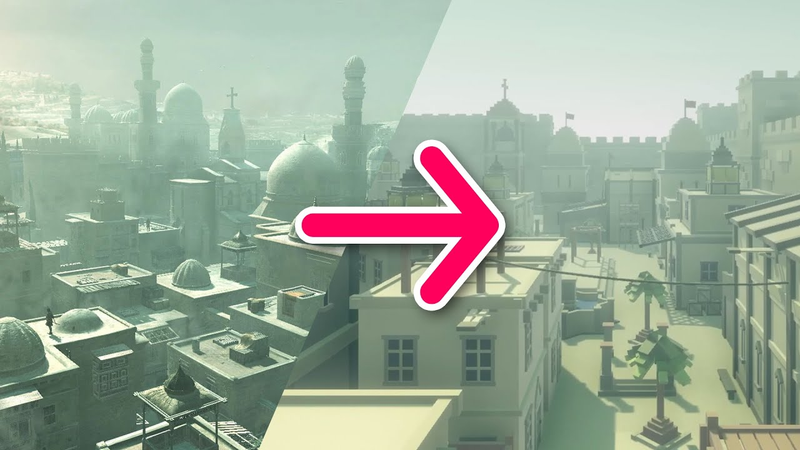
Remaking Assassin's Creed Level W/ NO MODELING SKILLS
Key insights
6 takeaways- 01Environmental design can be achieved without advanced modeling by deconstructing complex architecture into basic geometric primitives like cubes and triangles.
- 02The combination of geometric simplification and asset recycling enables developers to maintain a cohesive visual language while maximizing limited resources.
- 03Limiting a scene to an intentional color palette helps establish distinct atmospheres and cultural identities for different game regions.
- 04Color palettes are essential for environmental storytelling and navigation, as demonstrated by the use of warm oranges for Damascus and teal tints for Acre in Assassin’s Creed.
- 05Strategic asset repetition allows for the efficient scaling of large game worlds by categorizing objects into layers, ranging from background props to high-visibility landmarks.
- 06Post-processing effects and constrained color choices serve as visual cues that manage player focus and prevent confusion in open-world environments.
Ask AI about this video
Transcript
Hey guys, my name is Felipe and I am the 3D artist at Thomas Studio. Today we're going to be doing another remake inside Unity of a not so modern game this time, but still not that old either. We're talking, of course, about the original Assassin's Creed. The game is a phenomenal example of attention to detail, especially when it comes to the environment art department. It's known that Ubisoft spends a ton of time researching for these games. And even though they've taken a lot of liberty [music] with the material and historicity, I still think it's a commendable effort in recreating a convincing yet fantastical representation of cities that existed over 800 years ago. So, when it comes to being an expert in a subject matter, I
would say that they scored pretty well, even with some inaccuracies here and there. It became known that the franchise started off as a potential Prince of Persia spin-off. And though each title has its own merits, I think it's safe to say that the range and the freedom Assassin's Creed brought probably allowed for it to grow way past its humble beginnings. It is very evident though how much the first Assassin's Creed and the PS2 era Prince of Persia trilogy shared a lot in common when it came to the visuals and style. So the first point that I want to bring up today is that all things boil down to understanding basic shapes. If you squint your eyes, it's easy to notice that most things are really squares and triangles. It's no coincidence that I'm using a cube instead of a different shape because it is the most basic threedimensional object that we can work with. And that's not too different in reality. Obviously, one of the first things that I like to teach when it comes to 3D is learning to observe your environment from the
perspective of a modeler. These basic geometrical shapes were chosen for a reason. They're part of a very elegant mathematical language. And because our architecture is understood through the logic of math systems, it's no wonder why we see them repeating for millennia. So if you want to be an environment artist, I highly suggest that you start this exercise. Look for shapes wherever possible or at least try to reduce form into the most basics. Our brain already do most [music] of the job without us even realizing it. Also, this should help you understand what are the most important elements that you should focus more detail on compared to something not so important to the overall shape. In fact, we're going to go back to this statement in a little bit. The second point is learn how to work with a very limited color palette. Why? Well, because I'm telling you to. No, really, it can actually drastically help you improve in many areas. One to mention is that by constraining yourself to a
smaller range of options, that should force you to find smarter solutions for composition and the understanding of focus and value. A lot of indie games make use of limited pallets as well because, well, it helps tighten the art and budget together, and a beautiful art can come from limiting yourself to adjacent colors. Assassin's Creed has very distinctive tones for each of its main cities. And that also comes to play with helping us the player in situating where we are in this world. Probably because it can get a little bit confusing sometimes after many hours playing as well. So if anything, this already works from an assistance point of view. Even though the models have their own colors, for example, the wood is still dark [music] brown regardless of which city you're in. The use of different light and post effects helped create these very unique atmospheres that also likely helped the team of developers expressing different ideas. Damascus, one of the major cities [music] in the game, is dominated by the Sarissens and it has this warm orange
filter all over the area. The city of Acre on the other hand is dominated by the crusaders and [music] it has that teal blue tint while Jerusalem has that green that sometimes is closer to yellow orange and at other [music] times is actually closer to blue. That was probably used to indicate the conflict between these people at a time. Now how these color choices can make you feel can be very personal and debatable at the same time but all of them share similarities in their presentation. Everything in this game kind of feels foggy, dense, [music] arid, dusty. You can see a lot of brighter, lighter colors bouncing off walls and rooftops. [music] And generally, that's how I remember this game a lot before revisiting [music] it for this video. I just want to make it clear though that despite having observed all this, I'm not saying that I am particularly great at this. This is as much of an exercise for me as it might be for you. I've come to the conclusion that there's a lot to benefit from experimenting with limited color palettes both in an indie and AAA
context. How long you should stay on this path? As long as you feel you have a good understanding of working within these limitations. Basically, all I'm trying to say here is that if you can pull off making a scene that works well and harmoniously with less, imagine what you can do with more. The third and last point of our video is asset [music] repetition. And talking about acid repetition, I'm reusing the wires from the Red Dead Redemption 2 video. So, in case you're asking, yes, that's actually a [music] stretched cube with a few extra segments added in order for the cloth component inside Unity to work. That way, with a little setup, we can simulate physics even with a very, very low poly object. Props play a major part in helping with the repetition of assets such as [music] buildings, monuments, and anything that is big enough to be noticed as a recycled asset. [music] This is an extremely common practice of double and AAA studios, and it all comes down with having enough props to distract the player from the fact that
it's actually the same house. Although it may need a little bit of forgiveness from the player, just because a game like [music] Skyrim has a few copy and paste dungeons, it doesn't make it a less impressive game, especially when it comes to its scale. [music] And well, Assassin's Creed as well as other openw world games are not exactly strangers to this method. How do we make it less noticeable? I was thinking about that for a while and it's actually not an easy question to answer and I guess it's all about balance. I would probably recommend you studying photography and painting for a bit [music] more in-depth explanation of what a good composition means. But essentially, it's all about looking at all directions cuz after all, we're talking about a 3D space and finding that your eyes are not being pulled in any specific direction for too long, long enough for your brain to notice the patterns. [music] In other words, it's making sure that your design is not overpowering any space of your screen. And the same thing is true with the frame or canvas. Keep [music] in
mind that making one area look different isn't good enough. You have to think about making entire game sections work without [music] breaking too much of this illusion. So, it's kind of working within the guideline. Let's take for example a bench. We see this commonly placed almost everywhere in the [music] city. So, they kind of become invisible to us unless we're choosing to focus on them. Let's call these objects part of the first layer. We could probably add trees, barrels, crates, [music] and things like that into this group. Scaffolds, on the other hand, even though they're are commonl lookinging objects, [music] they still need to be positioned strategically to give the player pathing to reach certain areas or to help them navigate vertically. And because they are rather boring and simple, they aren't exactly the most noticeable if used correctly. So if you have them scattered enough or positioned in different angles, they could help make a recycled building look more unique. We could probably add these steps, wood frames, and even these water
fountains in the second layer. Now, let's talk about this red flag, for example. I don't know whether this is [music] an important symbol in this area or not, but just by the way it's positioned, meaning it can be seen from both at the top the roofs and from the ground and the fact the color is so vibrant, you can't help but notice it immediately. The same thing can be said about these hiding cabins that are usually positioned in rooftops. This is the third layer, which are the landmarks of each area. Props and elements like these should be sparse, and if used correctly, they could even also help with distracting the player in some situations. Just like we were talking about the limited color palette, it's all about understanding value. So, a few quick tips. Pay attention to symmetry and uniformity and how each is applied to the layers we discussed just before. [music] We are pretty good at recognizing similarities and differences. So find where you need that to be more or less evident. Also, you have to consider previous experiences the players might
have had. Think about locations that they might have visited within a reasonable distance and time frame and try to avoid compositions [music] that could be too equal in terms of value and presence. Not only this is all important from an aesthetic perspective, but it's also part of designing a level and a player experience. All right. So, let's take a look at our final result.
And if you thought that we did a good job, leave a like and subscribe to the channel for more content like this. And I'll see you guys in the next one.
Summary
The process of recreating game environments without advanced modeling skills relies on three fundamental pillars: geometric simplification, color palette management, and strategic asset repetition. By deconstructing complex architecture into basic shapes like cubes and triangles, artists can establish a foundational structure that mirrors the mathematical logic inherent in real-world design. This approach allows developers to prioritize essential forms while maintaining a cohesive visual language, a technique frequently utilized in both indie and AAA development to ensure efficiency and clarity.
Color theory serves as a critical tool for environmental storytelling and player navigation. By constraining a scene to a limited, intentional color palette, artists can create distinct atmospheres that help players distinguish between different game regions. In the context of the original Assassin’s Creed, specific color filters—such as warm oranges for Damascus or teal tints for Acre—effectively communicate the unique cultural and political identities of each city. These atmospheric choices, combined with post-processing effects, help manage player focus and provide visual cues that mitigate the potential for confusion in large, open-world environments.
Finally, the effective use of asset repetition is essential for scaling game worlds without sacrificing immersion. By categorizing objects into layers—ranging from ubiquitous background props to strategic navigational elements and high-visibility landmarks—developers can recycle assets while minimizing player detection of patterns. Success in this area requires a balance of composition and spatial awareness, ensuring that repetitive elements remain unobtrusive while unique focal points guide the player through the environment. Ultimately, mastering these constraints allows artists to produce harmonious, professional-grade levels by maximizing the impact of limited resources.














Comments