1 free read left. Create a free account for unlimited reading + AI research.
Create free account
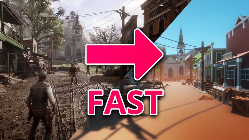
Make a RED DEAD REDEMPTION level w/ NO MODELING SKILLS
Key insights
6 takeaways- 01Complex architectural styles should be deconstructed into modular, reusable components to create recognizable game worlds without requiring advanced modeling skills.
- 02Visual storytelling relies on the strategic use of silhouettes and distinct architectural features, such as varied roof angles or signage, to differentiate building functions.
- 03Environment design can be effectively executed using only basic geometric primitives like cubes to test spatial understanding and shape composition.
- 04Maintaining grounded architectural proportions, even in stylized environments, is essential to prevent the design from entering the uncanny valley and to ensure world cohesion.
- 05Establishing thematic consistency requires a limited color palette, such as the muted browns, oranges, and greens used in Western settings, to ensure visual harmony.
- 06Post-processing effects like ambient occlusion, bloom, and color grading should be used as additive refinements rather than as a substitute for strong foundational art direction.
Ask AI about this video
Transcript
[Music] Hey guys, my name is Philippi and I am the 3D artist at Thomas Studio. So, I heard you guys liked my previous video, and I decided to challenge myself again and make another demake of a modern game using only the cube primitive. Why? Because I'm crazy and because it's fun. Just a quick reminder though, as you guys pointed out, this is not the best way to do this. Yes, there's a lot of ways that you can make a scene like this, and probably you don't want to use the Unity Primitive Cube, but it's a great way for you to test your skills and your understanding of shapes and colors. And also, you can kind of get a decent result with just a little bit of work. This doesn't really take that long to make. As usual, I started looking for
lots of references. I watched gameplay footage because I haven't played this game in a while, and there's just so much that we can do here. But I'd like to give a shot with one of the starting areas in the game in the little town called Valentine. I think it's just a perfect demonstration of how much love Rockstar put into this title. Plus, it just screams classic western movies all over the place. All you need is one main road, a few buildings that look like cardboard boxes from a child's play, and you got your cowboy town. Anyway, so I started with the ground using a cube. And as I moved on to the very first building, one very important aspect about this architecture is how things are supported. Almost everything is built on top of a platform, usually made of wood. So by making one, I could probably reuse it for all the other buildings and just make some minor adjustments when needed. Once that was done, I started adding
some base pillars around the corners of the bigger cube, as well as placing some collar to help differentiate these shapes from one another. One thing that we can quickly notice is that most of these constructions feature balconies, and a large majority of them are only twotory tall. And that's another factor that will help things blend together. Even if later we just start copying those buildings and we make only little adjustments. We could spend hours making dozens of different types of walls, pillars, trims, doors, and windows. But the reality is that all we need here is to make a few that are distinctive enough for one another. So when we put them side by side, it's not that obvious that they are practically the same, especially when surrounded by props and smaller details. Keep in mind though that on the other hand, it's very important to make locations feel unique and quickly recognizable. And that's even more important if that building has ties with the mechanics and gameplay in some way,
such as a general store, maybe some gun or ammunition vendor, a saloon that can serve different purposes, etc. That can be achieved sometimes with a slightly different shape to the house. A roof that is oriented in a different angle. Written signs are probably the most obvious and synchronous to our world, but also color. And we're going to talk about that in a little bit. Ultimately, learning to observe shapes and manipulating them well. It's a big part of building a world and being an environment artist. But becoming an expert on the subject matter you're working with is what will set you apart. It's learning and confining yourself into the rules of what you're trying to emulate so that things don't stick out as odd or unmatching to your overall work. The same can be said about fantasy architecture because even for things that don't exist in our world, it's generally better to ground certain choices on reality so it doesn't fall into the uncanny valley. So, we can see
that even with the most primitive style, if you know what you're doing, the shapes will ring true even to the most casual and inattentive observer. Now, did I mention color? That is something incredibly important to master when you are responsible for the art in your project. In the previous scene I worked on using this method, I've limited myself to a palette of three shades of the same color, one being the darkest and three the lightest. I felt that worked quite well for the purpose of the exercise here. So, I decided to stay on this path, just adding more options based on what this game required. And while you may want to have more colors available to you in your own projects, it's very useful and important to establish at least a few core choices that will dictate the mood and feel of the world that you're building. Red Dead Redemption 2 had the daunting and daring scope of coming up with a convincing environment that not only brings fidelity, but it stays in the realm of its own theme. You have a large presence of muted browns, reds, yellows, oranges,
and greens. We've got a natural blue sky, the overpresence of fog and smoke, and all of that helps blend in different gradients. The same can be said about the character's clothing, props, and objects of interest. Even accent colors that are usually reserved for contrast don't strain too far from these core choices. I think for some people, this can all be very intuitive. Like duh, obviously. But here's what you can do if this isn't for you. I would strongly recommend you to get cozy with Adobe Color, which is an interactive free website that will teach you some of the basic color harmonies. You can choose what you want to see first, then play around with the color wheel and grab the RGB values to use on your design. For example, we can take a look into complimentary colors and have a better idea as to why so many movie posters designers have chosen blue and orange as well as finding out why the Joker wears a purple suit.
Another cool thing that this website allows you to do is uploading an image and will help you detect and pick the most relevant colors from it as well as helping you create gradients that will match what you see. Last but not least, we got to talk about post-processing. Pretty much any game nowadays can and should make good use of these effects. Even though they can be a little bit costly in terms of performance, they can be used to elevate and make even the simplest style look nicer and more polished. But instead of thinking about these as means to cover up for simplicity, make sure you are using them purposefully. And you can bet your dead man's hand that Rockstar did just that with their game. For something like this, I used ambient occlusion to help highlight the differences between the shapes and add more depth perception to what is a very flat surface world. A touch of bloom to create that thicker atmosphere with some humidity. A little bit of vignette to
simulate a bit of that light adjustment to the human eye in a very bright space. And I topped all that with a very subtle color grading to push some warmer tones. It's not because you have all these options that you should use them is really about finding a balance. It's also important to not rely uniquely in what post-processing can do for you. It is and it should be treated as an additive rather than a means to create your basic look. What I mean by that is ensure that the art direction and the visuals stand on their own and really speak to the message you're trying to convey. and then use this resource to enhance what the bases can achieve on their own or not without quite a bit of extra work. So, let's take a look now at our final result. [Music]
That's it, guys. I hope you like the result. Don't forget to subscribe and leave a like if you thought that we did a good job. And I'll see you guys on the next one. [Music]
Summary
Environment design can be effectively executed using only basic geometric primitives, such as cubes, to test spatial understanding and shape composition. By deconstructing complex architectural styles into modular, reusable components, developers can create recognizable game worlds without advanced modeling skills. This approach emphasizes the importance of observation and the strategic use of silhouettes to differentiate structures, such as using varied roof angles or distinct signage to distinguish functional buildings like saloons or general stores from residential ones.
Mastering color theory is essential for establishing the mood and thematic consistency of a project. By limiting a palette to a specific range of shades—such as the muted browns, oranges, and greens characteristic of Western settings—designers can ensure visual harmony. Tools like color wheels and image-based palette extractors serve as valuable resources for those who lack intuitive color sense. Maintaining a grounded approach to architecture, even in stylized or fantasy environments, prevents the design from falling into the uncanny valley and ensures that the world feels cohesive to the player.
Post-processing effects, including ambient occlusion, bloom, and color grading, serve as critical tools to enhance depth and atmosphere. While these effects can elevate a simple, block-based aesthetic, they should be treated as additive enhancements rather than a substitute for strong art direction. A successful environment relies on a solid foundation of shapes and colors that stand on their own, with post-processing used purposefully to refine the final visual output. By balancing these technical elements, developers can achieve a polished, professional look even within the constraints of a minimalist, primitive-based workflow.





















Comments