1 free read left. Create a free account for unlimited reading + AI research.
Create free account
5 Steps To Making A Gorgeous 2D Game
Key insights
6 takeaways- 01Establish hit areas and collision boundaries first by tracing simple vector shapes over game engine screenshots to ensure functional gameplay accuracy.
- 02Use high-contrast design to clearly distinguish between traversable ground and background elements, ensuring players can immediately identify interactive zones.
- 03Apply contrasting color palettes, such as blue and orange, to create visual separation and depth between foreground and background layers.
- 04Implement a parallax effect by moving foreground elements faster than background layers to simulate environmental depth and immersion.
- 05Maintain visual consistency and production efficiency by strategically reusing a limited set of pre-designed assets rather than creating unique art for every frame.
- 06Treat 2D game art as a systematic engineering process that prioritizes planning, standardized workflows, and technical optimization over individual artistic talent.
Ask AI about this video
Transcript
[Music] hey guys my name is Thomas fresh in the creative game called pinstripe and I'm also working on a game called once upon a coma I want to show you how I do 2d art work and more specifically I want to give you five steps to ensure that your artwork is not only beautiful in your 2d game but it also also makes sense basically it works with the gameplay it feels the right size for the player and it also works with the functionality of the game so let's get started this is a time-lapse of me working on artwork for my game once upon a coma if you want to check out the game take a look at the link in the description alright so I always start out with just a block out okay so a simple vector art tracing the actual hit areas of the level so I take a screenshot of you the game in unity and you can also see this working out in games like halo halo even starts out with a block out I'll trace that screenshot with simple vector art and
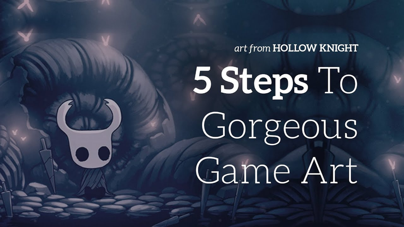
then I'll clearly define the edges of that hit area so very simple vector art here inside a Photoshop and then I this second step for your artwork the best thing to do is really to define those areas so I'm simply defining the hit areas making them brick and also adding a lip to that brick and you can see this done in games like hollow Knight hollow Knight is a great example of hit areas being clearly defined you know exactly where you can stand in the game and there's a clear contrast between the hit areas and also the background elements so it also helps just to have a simple maybe some grass or bushes or something that makes the hit area feel like it's nestled into the world so here I am simply drawing some vector art for the grass of the level so it's a great way to make the player feel like they're actually not only on ground
but that ground is placed inside of the world so the third step to your artwork is to create pop with your palette this is creating contrast with your color palette so as you can see the background of the world is blue and then we pop it with orange and you can see this kind of pop in artwork from a great artist named Ivan Durrell and Ivan Durrell is a Disney artists that I really love I think he's from the 50s but he does a great job creating contrast between foreground elements and background elements you can also see this in night in the woods night in the woods does a great job of creating very clear contrast between the ground and the background and I've also done this with pinstriped so you can see that there's basically two colors in this scene there's blue and there's orange there's also that brown but mainly there's two contrasting colors and then what we do is we gradient between the two so notice the contrast of the bushes here dark dark blue and
then it's contrasted with with the orange and the brown that allows the there's a clearly defined line between the ground and the background so right here I'm actually adding some bushes and those bushes are a way for me to allow that contrast to actually blend with the background so we have a clear distinction between the ground and the bushes which is a great place to put the player but in terms of the background going from the bushes to the background we slowly blend with a gradient and then here we can add some more layers to the grass to allow the grass to feel like it's actually coming towards the camera none of this is actually 3d it's all 2d adding shadows especially skewed shadows allow it to look like it's not only the evening but also that the elements again are three-dimensional and coming towards the camera we also do that with some simple bevels and overlays of various
Sun shafts coming across the grass here so the next step that we're gonna do from creating artwork that is actually intuitive and makes sense for the player is we want to add depth with layers and I would say that holo night is the best example again for creating layers in a game as you can see there's almost it feels like an infinite amount of layers and it just goes into the fog in the background this is a great example of using layers I used to be really afraid using too many layers in a game and this is especially true in the flash era but now with with technology being and computers being as quick and fast as they are you can create almost as many layers as you want and what I usually do is start out with about 10 layers and in the Polish phase of creating a game I will add more and more layers to give it that feeling of give the player feeling like they're submersed in the environment so here you
can see in the demo we've got about 10 different layers that track foreground elements move much quicker than the background elements and so these layers in Photoshop I'll merge all of these graphics into about 10 different layers and I'll import those into unity again coming back to the concept of merging layers or blending layers especially in the background in the foreground what I mean there is adding shadows and bevels that slowly blend from color to color to color the various layers so that they almost look blurry so this is the detailing phase and this is certainly last but it's not least you want to make sure that you really focus on the detailing now it doesn't mean that you have to clutter your frame with a bunch of details what it does mean is creating very intentional graphics so as you can see I've got flowers and vines here that I'm using from my Adobe Creative Cloud library that I created about three weeks ago so I can just duplicate these objects in various places they're not
all over the place they're in specific strategic places but it allows the frame to have a clear scale so the player can understand how big items actually are because we have vines trees and flowers that are relative to the player size so finally right here we're simply stamping various trees in the background to give that final hint of depth and these trees will slowly blend into just a simple fog of glue these again were created a while back so as you can see a lot of this artwork is just simply using stamps and/or in Photoshop brushes and just duplicating them in a strategic way so that it looks unique and every frame looks new but really we're using about six different art assets in total patterns and various art assets so again as you can see we're blending into the background and then we're also going to be adding a various various hints of a
mask and that blends the tips of the trees into one another so it looks like they're going into the fog so there you go we're just slowly blending in the trees to make them blend in the fog so the a tip that I'd like to mention here is that you need to prepare and practice and what I mean by preparing is really learn and understand exactly what your color palette is what your shapes are and how you want your game to look it took a long time almost two months for me to figure out exactly what I wanted once upon a coma to look like it started out looking like one thing and it ended up looking like this and that was a long process of practicing and prepping my artwork and understanding what my color palettes were so this is obviously a time lapse right and it looks like it's really easy and I know exactly what I'm doing but there was a lot of preparation coming into this understanding exactly
what I was going to be doing I think a good artist is not only creative but they're also thinking like an engineer or an architect there there's a mathematical approach to doing your artwork and there's a system every time I do a frame for art working once upon a coma it's generally the same exact process it's these five steps over and over and over again and it's not because I'm some genius it's because I actually practiced these and was diligent trying to understand exactly what I was doing and what patterns I was gonna be using so you can see here I'm just using the same patterns over and over again these are patterns that I strategically made to be able to be used in a scalable a scalable strategic way and then just adding various gradients so it's taking reusable objects and sort of blending them into the environment so yeah don't don't feel bad if you can't create artwork really fast once upon a coma the
artwork was created in a slow process where I planned the color palettes and it also allows the game to be scalable and that's why it feels consistent from frame to frame because there is a process involved so that's my process for creating 2d artwork that not only is beautiful but it also makes sense to the player and works with the gameplay again my name is Thomas brush if you like this video please leave a comment below I'd love to answer any questions you have hit the subscribe button and if you want to hear the rest of this video which includes more tips about 2d artwork please head on over the patreon page there's a link in the description and if you support and become a patron you can take a look at the bonus content in all of my videos thanks again guys means a lot see you later bye
Summary
Creating high-quality 2D game art requires a systematic, engineering-focused approach that balances aesthetic appeal with functional gameplay requirements. The primary objective is to ensure that visual elements clearly communicate hit areas, player scale, and environmental depth. By utilizing a repeatable five-step workflow, developers can maintain visual consistency across a project while efficiently managing asset production.
The process begins with a block-out phase, where simple vector shapes are traced over game engine screenshots to define hit areas and collision boundaries. Once the layout is established, the second step involves clearly defining these interactive zones through high-contrast design, ensuring players can distinguish between traversable ground and background elements. The third step focuses on color theory, specifically using contrasting palettes—such as blue and orange—to create visual pop and separation between foreground and background layers.
The final two steps emphasize depth and detail. Developers should utilize multiple layers to create a sense of immersion, with foreground elements moving faster than background elements to simulate parallax. Detailing should be intentional rather than cluttered; by strategically reusing a small set of pre-designed assets, such as vines or trees, developers can establish a consistent sense of scale and depth without needing to create unique art for every frame.
Ultimately, the success of 2D game art relies on preparation and practice rather than innate talent. By establishing a standardized system and investing time in planning color palettes and reusable assets, developers can create scalable, professional-grade environments. This methodical approach ensures that the final product remains cohesive, intuitive for the player, and technically optimized for modern game engines.













Comments