1 free read left. Create a free account for unlimited reading + AI research.
Create free account
5 Steps To Gorgeous Game Art

Key insights
6 takeaways- 01Using established color harmonies—such as complementary, triadic, or analogous schemes—creates visual appeal that is naturally processed by the human eye.
- 02High-quality game aesthetics are achieved through strategic design principles rather than raw artistic talent, allowing indie developers to prioritize intentionality over high-fidelity assets.
- 03Scenes should be constructed as coherent compositions of basic shapes like squares, circles, and triangles before any complex details are added.
- 04High-quality, full-frequency audio feedback acts as a sensory multiplier that can make low-resolution visuals feel immersive and premium.
- 05Minimalist scene organization that respects player focus prevents the amateurish appearance often caused by cluttered, disorganized environments.
- 06Atmospheric depth, implemented through techniques like lens blur and fog, is essential for separating foreground elements from the background to establish scale.
Ask AI about this video
Transcript
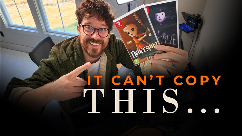
By the end of this video, you're hopefully going to know how to double your game's revenue because, well, you were able to make it stand out among the other games on Steam. Now, it's not about skill. I don't care if you are the most talented artist or you suck at game art. Succeeding in game art is all about strategy. And as a time featured 2D and 3D game developer, I'm going to tell you my five steps to gorgeous game art. Let's do this. Now, this is my Game Never song. It's been featured by the Washington Post, sits at a very positive score on Steam, and was bought by Apple Arcade. That was one of the biggest deals I've ever done in my career, and it's all thanks to, well, color. This screenshot is beautiful, but why is it because of the detailing? No. Does it look realistic? No. So, what exactly makes a screenshot like this look good? Well, it's all about color theory. It all comes down to simple math. Math is beautiful. There are a ton of color theories, but the six most valuable to know are the following: monochromatic, analogous, complimentary, split, complimentary, triad, and tetratic. If
it's not obvious what these are, basically we have a color wheel here, and we've got two or three opposing colors being chosen on the wheel. Why do complimentary colors look good? Why does triad or analogous? I honestly don't know, but they just look good. The human eye loves these types of harmonies. I mean, it's the same with sound. Why do these sounds harmonize? [Music] But these don't. They're soothed by harmonies. In this case, six color harmonies. My suggestion is to use complimentary color as often as possible and maybe even be a little bit more strategic about its usage. Let's find two opposing colors. Let's say green and red. Maybe let's shift them to be a bit more warmer. And also,
let's decide which color gets the most attention. So, maybe a little bit more green, less red. That is beautiful. And this is a scene from my game Father, and we're currently working on this game. Now, let's instead just choose random colors for this scene. [Applause] [Music] So, do you see why color theory is so important? Just take a look at these games that use color harmony so effectively. Night in the Woods is using triadic harmony. Hollow Knight is using complimentary harmony. The same is true with Firewatch. It uses complimentary harmony. In fact, most beautiful games use complimentary color theory. Posing color harmonies, for some reason, just catch your audience's attention. This is an illustration I did with a variety of hyperdetailed shapes that I Googled. Now, this is an illustration I did with a variety of super simplistic shapes. Which one looks better? The second one. But why? It's because it capitalizes on a simple fact of our actual world.
Everything is basic shapes. Most things are basically squares, circles, and triangles. So, what exactly does this mean? Especially if you're an untalented, wannabe game artist. It means you should prioritize knowing why artwork looks good in the abstract, in its most simple, basic form before you start adding detailing. Or maybe don't even add detailing at all. One of the biggest mistakes an indie game developer makes is trying to polish his or her game before knowing for certain it already looks good in its most rudimentary abstract form. Maybe you don't believe me. Let's blur an image of a horizon. Now, let's zoom out. It still looks like a horizon, doesn't it? That's because it's using basic shapes and honestly, good color theory. Here's a tree. What shapes make up this tree? Here's a pine tree forest. What shapes make it up? Here's a cityscape. What shapes make it up? Here's beautiful Alex Vance. What shapes make her up? So, as you go about your life, just observe and
study the world around you, and you'll see that it's all basic shapes. These basic shapes are the foundation to beautiful artwork. And after you understand these basic shapes, you can add detailing or just don't even add detailing at all. Have you ever watched Peppa Pig? That show looks like crap. Muted. But suddenly when you turn the volume up, it looks great. What a great painter you are, George. That's because sound informs our eyes. Our senses are not independent of one another. They're connected. Here's another example. Let's play Golden Eye with great sound. [Music] Now, let's play it with terrible sound. Your game can look like it's from the '9s. It can use simple shapes, simple color theory, but if it has killer sound, it's going to suddenly feel
completely alive and more importantly feel like it's worth the $15 that you're asking for. So, how exactly do you create beautiful sounds that complement your artwork? Well, there's actually two ways. The first is to ensure your sound is immediate. This is because of something called game feel. Essentially, you want your player to feel like they are in your world. They won't feel like they're in your world. If they press a button and they don't get immediate feedback. So, when they press play on a menu, for example, instead of no sound or maybe a slow sound, why not play an immediate epic sound? Suddenly, the game looks and feels 10 times better. The same is true for footsteps, attacking, or snorting. The second way to use sound effectively is to provide a full range of frequencies in your sounds. So for a gunshot sound, instead of just a bassy boom for a rocket, why not also throw in a mid-range sound and a high-pitched sound?
We're taking all these sounds from freesound.org or maybe artless.io and then we're combining them all to hit all the frequencies. Fast and full audio. That's how you make your visuals pop. Fast and full. Works in other areas of my life as well, especially with your mom. This is a scene from my game about a dog. Doesn't have a name yet, but it's a game that I'm really enjoying working on. It's kind of a mess. There's a lot of strange lines and tangents all over the place. There's not really much intention behind this world. Now, this is the same game asset, same scene, but things are placed strategically. It looks 10 times better. That's because of organized intention, aka cleanliness. Players can sense, even on a subconscious level, how much time you've spent on your game's scene. They don't know that they sense it, but they just do. And this feeling of respect, this feeling of cleanliness, it makes things weirdly look beautiful. It's why the
original Banjo Kazouie from the '9s looks way better than Banjo Kazoui Nuts and Bolts. It's because the newer, high-res, higher poly game is a junk drawer. Everything is everywhere. It's also why Super Hot looks better than Babylon's Fall, which is rated one of the 10 worst games of 2022. Less is more. Clean up your scene, especially if you're an indie. You don't have the money or the time to create billions of assets and billions of textures. really, you should limit yourself because of your budget. And that limitation is actually a strength. Last, but most definitely not least, let's talk about depth. When in doubt, add some depth to your scene. Whether it's 2D or 3D, adding depth to your scene is going to make it really pop. This is one of the primary reasons Hollow Knight looks so freaking incredible. This scene in particular has, I don't know, 12 layers or maybe more. Now, depth doesn't just magically occur when you stack sprites on top of each other in 2D or if you create a really big world in 3D. Depth
actually occurs because of two primary reasons. Fog. Global fog in 3D is actually pretty easy to apply. In Unity, you just simply tick the global fog box and mess with the parameters and voila, it magically appears. In 2D, this is a bit more challenging. Essentially, you need to decide what color the farthest point of the camera is. for example, a blue or gray sky, and you slowly blend the layers into that color as they get further and further away from the camera. And by the way, this is true in any weather or temperature or climate, everything eventually fades into a single color. That's because of atmosphere. No matter how thick or thin the atmosphere, things are eventually going to blend into the sky. This is actually one of Bob Ross's primary tricks in his paintings. Second, you can also use a lens blur effect in 3D or in 2D, maybe add some gshion blur in Photoshop to your sprites. As objects get further and further away from the camera or they get closer to the camera, you can add some blur. This is done in games like Hollow Knight. Now, these two
methods are especially valuable to use in low-end games from the '90s or just lowbudget games like yours. Here's Silent Hill with fog and without fog. If you do these five steps to your artwork, I promise you it's going to make your game look so much better and help you stand out on Steam. Thanks for watching, guys. If you enjoyed this video, be sure to leave a like, subscribe for more indie game content like this, and also leave a comment below about what you
Summary
Achieving high-quality game aesthetics is a strategic endeavor that relies on fundamental design principles rather than raw artistic talent. By focusing on five core pillars—color theory, basic shapes, sound design, scene organization, and depth—developers can significantly enhance the visual appeal and marketability of their titles. These techniques are particularly effective for indie developers working with limited budgets, as they prioritize intentional design over high-fidelity assets.
The first step involves applying color harmonies, such as complementary, triadic, or analogous schemes, which naturally appeal to the human eye. This is followed by a focus on basic shapes; developers should ensure their scenes function as coherent compositions of squares, circles, and triangles before adding complex details. Furthermore, sound design acts as a critical sensory multiplier. Immediate, high-quality audio feedback—characterized by a full range of frequencies—can make even low-resolution visuals feel immersive and premium.
Cleanliness and intentionality are equally vital. Cluttered, disorganized scenes often appear amateurish, whereas a minimalist approach that respects the player’s focus creates a sense of professional polish. Finally, the effective use of depth—achieved through atmospheric fog and lens blur—helps separate foreground elements from the background, creating a sense of scale and atmosphere. By implementing these strategies, developers can create cohesive, professional-looking games that stand out in competitive marketplaces like Steam, regardless of their technical constraints or artistic background.



















Comments