1 free read left. Create a free account for unlimited reading + AI research.
Create free account
A subscriber sent me their game for a MAKEOVER
Key insights
6 takeaways- 01Adding narrative context, such as a clear objective like a bird searching for lost eggs, creates an emotional hook that improves player retention.
- 02Simple mechanics can achieve market differentiation by applying cohesive thematic integration, intentional art direction, and atmospheric design.
- 03Visual identity should be established through deliberate, non-traditional color palettes and textures rather than generic aesthetic choices.
- 04Unique audio branding is essential for establishing a distinct mood, replacing generic musical choices to help a title stand out in a saturated marketplace.
- 05Technical implementation of parallax scrolling and perspective cameras creates a sense of depth and urgency that elevates the user experience beyond standard orthographic views.
- 06Atmospheric design should utilize desaturation and value shifts in background elements to ensure gameplay-critical objects remain the primary visual focal point.
Ask AI about this video
Transcript
Hey guys, it's Thomas. I make indie games for a living and my goal is to teach you how to do it as well. In fact, I wanted to see if I could help one of you, my subscribers, Newton, with his game. Hi, Thomas. Oh my god, that's awesome. Thank you so much, Thomas. I look forward to seeing the results. I know for sure it will be amazing. You're the best. In this video, we're going to jump into Newton's project and we're going to make it gorgeous. And because I've always been a generous man, I'm going to send this project back to Newton and I'm going to let him use the art files however he wants. It's his game and I just want to see him succeed. All I ask for in return from Newton is 90% of the game's revenue upon release. All right, so Newton sent me his project which is a Flappy Birdesque game with a rotating box rigid body and it's built inside of Unity. The codebase is clean. The mechanics are easy to understand and the UI is actually pretty great, very informative. There's only one problem. Well, actually there's three problems. So, let's go ahead and get started on these three problems. The first problem is the [music] game's theme or the lack thereof. Is that how you say that? The lack thereof. Uh, currently I don't really see a theme and I think it's
maybe boxes or something. Despite the fact that I love a good box, I don't think that boxes are enough. I'm not sure what you guys think, but for me, I figured I'd try and flesh this theme out a bit more. Add a bit of story to the game. So, I made the square character a square bird. And I made the coins you collect a little X. So, now we have a simple story. Bird has lost her eggs. Go and find them. Now, honestly, this little thematic put goes a long way. I mean, you don't want a bird to lose her eggs, right? No, of course not. So, you're probably going to keep playing to help the bird, right? So, go ahead, open your phone. Yes. Do it now. Play the game. Good. [groaning] Good. Don't go to bed. Keep playing. Don't go to bed. Rescue the birds, little babies. Did you run out of coins? Buy some coins. Yes. So, you don't want the little birdie to lose her babies, do you? Do it. Do it. Do it. Now, good.
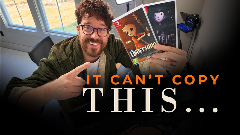
Now, obviously, a simple story element like this can be incorporated on top of the current mechanics. I mean, just because something is a primitive shape, like a square doesn't mean you can't retrofit story on top of it. In fact, Nintendo is obsessed with this. Everything inside of Mario and Kirby is basically squares and circles. This has been happening for decades. The world is insanely limited despite looking complicated. It doesn't matter whether it's the recent Mario Odyssey or the old Mario games. It's just squares and circles. Okay, so now we have a story. What else can we quickly do to make this game feel a bit more polished, more unique, more eye-catching? Well, from what I can tell, we have a game that looks a bit like other mobile games. Colors are bright, but there's not a lot of color strategy here. I mean, it doesn't really pop. It's not going to stand on its own amongst other games on the iOS store. For my games, Never Song and Pinstripe, which were actually featured by Apple. I think the feature was in some ways due to the coloring of the screenshots in the marketing material. I honestly believe color is a massive part of your game's marketing and appeal. So, I started throwing together a simple color palette for this game. Now, I've been doing this color palette thing for half of my life, just picking colors and seeing which ones
look together for my games and animations. I mean, sure, you can use a color picker tool like Adobe Color, but I actually like picking things a bit more instinctively, creating a color palette that hasn't really been made before, at least by the majority of indie titles out there. Now, I took inspiration from a good friend of mine. He's a comic book artist named Benjamin Shipper. His color choices are so interesting. They're kind of almost bizarre. You would never think to combine these colors together, but they work. So, we did that for this game. And by the way, here's a quick tip. If you're a terrible artist or you're just a mediocre one like me, start with a color palette. It's going to make your game look 10 times better. And let that color palette dictate every single decision you have moving forward. Do not stray from the color palette. It is the constitution of your game's art style. And hopefully, this kind of eye-catching art here will be the end result. Granted, it's not just the color that makes what you see here look good. Rather, it's the color being the core key ingredient and the gradients and the texturing being the I don't know, salt, pepper, and garnish of this art style. And I know texture sounds really complicated, right? Well, for me, I just
downloaded a texture pack from the Unity asset store and I actually just used it inside of Photoshop. I mean, this single wooden texture here is what makes everything looks so good. So, here it is with the texture. Here it is without the texture. With the texture, without the texture. I mean, see how easy that is? Just steel stuff. I mean, what I mean is buy stuff and then use it in your game. No, no, wait. It's not what you think. Now, the final problem with this game is I think just the [music] music. There's this temptation out there that a lot of indie game devs feel where they just want to keep things [music] safe. They keep things generic. This is especially true for mobile games. For example, the goal is to get as many eyes on the project, right? So, let's make the music generic enough for all audiences. The problem is every game is doing this. So, I think the smarter move is to use music that stands out from the crowd. So, I actually scanned through my recent game Never Songs folder and I found an old song that I had written buried in the folder structure. [music]
So, Newton, you can actually just use this song and keep it. It's yours totally free. So, now we have a game that looks more natury about a bird and her [music] eggs and the music really fits that mood. I mean, this song really isn't half bad, is it? I kind of changed my mind about this song here. Newton, you can actually just use this one. I wrote this when I was 16. Jeez, just kidding. Newton can keep my song and obviously he doesn't have to pay me anything for these project files. That said, I do expect 60% revshare. I'll send you my bank information after I post. So, all in all, guys, it didn't take much to make this game really pop. And popping is especially important for games that use overused mechanics, cuz we're competing with a lot of games that have similar mechanics, like Flappy Bird. But even games like Hollow Knight use overused mechanics. The whole game is an overused mechanic, at least when it comes to Metroid Vania style games.
But the visuals of Hollow Knight are what make it unique, the mood, the music. All right, let's play Flappy Square. Thanks so much, Newton, and I hope the project files I've sent over really do help you out. All I ask for in return is your smile and [music] a shimmer in your eyes. Let's play Flappy Square. All right, so this is our flip of Flappy Square. Very simplistic graphics here, but as you can see, like we discussed in the video, we've got pops of color. And what we didn't really mention in the video was I wanted to talk about depth. So no matter how simplistic your game is, um creating a sense of depth, especially for 2D games, is super important. [music] So first, uh the foreground here is moving much faster than the bird, right? And even though the foreground is moving significantly faster, it's not actually affecting our gameplay, [music] but it makes us feel more of a sense of urgency. And I think that's really important with these kinds
of games. Um, especially these repetitive games where you're moving kind of slow. Even though it might be challenging, you're moving slow. It's going to make things feel a [clears throat] little bit more urgent. Now, also, we're getting a sense of parallax because the background elements are slowly moving into the uh background on the Zaxis. So, the camera is a parallax camera or a perspective camera. Uh it's not an orthographic camera, which orthographic is typically what you do or or use with a 2D game. Um so we've got a parallax [music] camera uh that's creating that depth in the background. And here's the most important thing I wanted to discuss. The colors of the background are actually sort of a just lower saturated and lighter hue um or a lighter value of this pink bird. Okay. So that background is very desaturated and it's blending into the foggy background. No matter where you
are, there's always atmosphere. Even if it's a really clear day or a rainy day, there's atmosphere. And so that pink, that cotton candy pink atmosphere is slowly engulfing uh the elements as they move back in into the Z-axis. And that is allowing the colors in the foreground to really pop. [music] And that's basically telling us, hey, these are the elements you need to worry about. Here's the player. Here are the logs and the trees. Everything in the background is desaturated and lighter so that we're not confused about what the gameplay elements are. But overall, I'm really really happy with how this turned out, including the the subtle particle effects on the player. Um, so I'm really really proud of the developer here. Developer here. So, um, yeah, that is Flappy Square. I could play this for a very long time. Thanks so much for watching, guys. I really hope you enjoyed this video. Be sure to leave a like, subscribe, and leave a comment letting Newton know how
he did. Newton's a really good developer here. I'm actually impressed with this project. So be sure to be encouraging
Summary
The primary objective of this game development analysis is to demonstrate how to elevate a mechanically simple mobile game through thematic integration, intentional art direction, and atmospheric design. By applying these refinements to a basic Flappy Bird-style project, the analysis argues that even titles built upon well-worn, primitive mechanics can achieve market differentiation and player engagement through aesthetic polish and cohesive storytelling.
The analysis identifies three critical areas for improvement: narrative context, visual identity, and audio branding. By retrofitting a simple story—a bird searching for lost eggs—onto basic geometric shapes, the developer creates an emotional hook that encourages retention. Visual appeal is addressed through the implementation of a deliberate, non-traditional color palette and the application of textures, which serve as the foundation for the game's aesthetic constitution. Furthermore, the analysis emphasizes the importance of moving away from generic, safe musical choices in favor of unique compositions that establish a distinct mood.
Technical execution is highlighted as a key factor in professionalizing the user experience. The analysis advocates for the use of parallax scrolling and perspective cameras rather than standard orthographic views to create a sense of depth and urgency. Additionally, it stresses the importance of atmospheric design, specifically using desaturation and value shifts in background elements to ensure that gameplay-critical objects remain the visual focal point. By prioritizing these elements, developers can successfully transform functional prototypes into polished, eye-catching products capable of standing out in a saturated mobile marketplace.













Comments