VideoThomas Brush
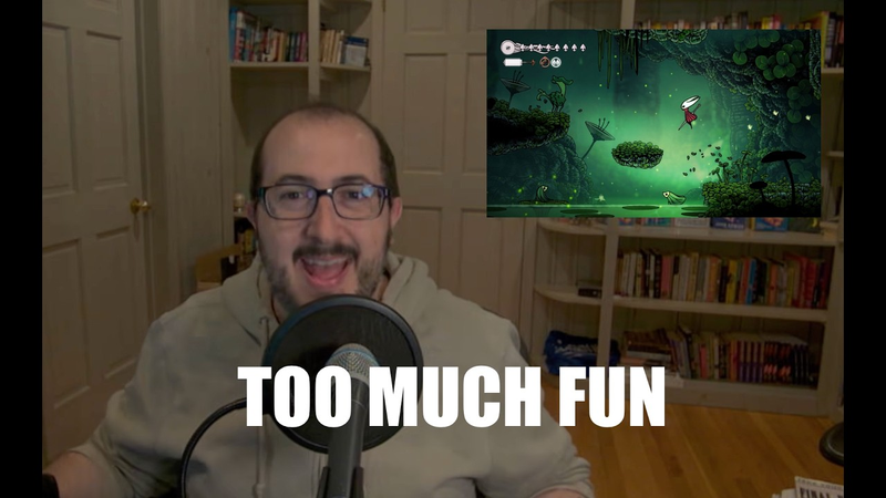
I Tried To Remake Silksong In 10 Hours (Hint: It Was Brutal)
23 Mar 202613 min video
Transcript
I had about the dumbest idea I've ever had. Last week, it was The idea was, "Hey, why don't I recreate Silk Song? And why don't I do it live?" It was a huge mistake. I
[laughter]
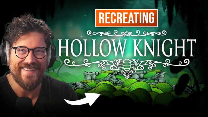
I mean, I am proud of what I was able to achieve, but it was such a painful process. And the reason why is because Yes, I make 2D platformers. So, like these This is like a Korean I think that's Korean. Is that Korean, guys? Korean version of my game Never Song in Pinstripe. Uh this is Never Song as well. These are platformers, right? 2D platformers. They have like a hand-drawn vibe. But, the difference between these games and let's say, you know, Hollow Knight is that Hollow Knight's hand-drawn, right? Meaning, it's like I think like actual, you know, real physical, hand-drawn artwork. So,
[music]
that's not one difference. The second difference is that there's a ton of parallaxing
[music]
in Hollow Knight that in Never Song is just not there. I mean, there's a There's some layers, but it's not like dozens of parallax layers. Also, there's frame-by-frame animation. Pinstripe and Never Song use a skeleton rig to animate, and there's tween-based animation. It's way easier. It's way more efficient. And it also doesn't look
as charming. Team Cherry does frame-by-frame animation, and it's mind-blowingly complicated. There's so many different states, especially in Silk Song of especially with the dress moving. There's so many states, so I just knew that that was going to be a pain in the butt if I decided to do this. So, anyway, my approach is going to be completely different in recreating Silk Song, and I knew that it was going to be hard. I did not know it was going to be as hard as it was. Oh, shoot. That really sucks. I'm not even going to react to it. So, let's go ahead jump inside of Well, we're not going to jump inside of Unity just yet. We're going to jump inside of this piece of paper and get started. All right, the first thing that I did First thing that I did was I created this piece of artwork here. The reason why I did it in an entire scene like this as opposed to drawing it like in pieces like this is because this allows me to understand the scale of things, right? This allows me to know, "Okay, the player is this big. Therefore, mushrooms should be this big, and moss should be this big." So, having everything sort of in its own little scene as I'm drawing it helped me a lot. Once I was able to get the core down,
like the basics of all the different pieces, then I could go in and start doing extra pieces like this cuz all I had to do was put the pace piece of paper together like this and I could see the relative size of things. This is very important to do obviously because it's important to have things sized appropriately, but the line work, this is what makes this so different from my other games and like any game that has like a vector art approach, maybe games like Limbo or Inside, line work overcomplicates things. It's so worth it though because it looks so good, but it makes things way more complicated because if you decide to scale up, let's say a piece of moss right next to the player, the line work can get so thick that it's disorienting and it looks cheap because the moss line work is thick but the line work for the player is small. So that right away I knew that was going to be a problem. So anyway, I took pictures with my phone of the various pieces of art and I emailed them to myself and then I just used the magic wand tool to get all of the line work on a Photoshop document. I took a photo of a just a simple photo of the art and I I brought it into Photoshop
and I cut it out so that all that's left is the black. So I'm going to grab my my magic wand here just to show you how to do it with this one here as well. That's it. Now I can change the tolerance, all that. But overall, that's what I want. I want to set it to not contiguous so that it grabs everything that's that same color. I'm going to press control C, paste it in and now I have this right here. Now why do I want this here? So that I can obviously have character art, that would be nice. I want to know it's exact size. And so this is probably a good relative size and it's good to have your character in the shot when you're working on the art for your game. You want it in the scene and in your in Blender or in Photoshop while you're working on everything else. Otherwise, everything looks off. So I want to make sure all of my line weights are equal in size and they look about equal here, so we're good. Once that line work was cleaned up, and I used my mouse. Yes, I did. I used a mouse I used a mouse to use the polygon lasso tool, and just
clean up the artwork. This is bugging me for some reason, so I'm going to fill that in a little bit. Just going to grab this black here, and just sort of do a gradient there. That looks better. That was bothering me. Um let's think of any other pieces that I need to clean up here. Yes, let's clean up ears here. Once that was all cleaned up, I just filled it in with the colors that Silk Song uses. This sort of yellowish neon green, and then this dark navy blue. I just filled it in, and then I separated the line work from what I had filled in. And then this is going to be probably heresy to Team Cherry, but what I did was I just added a bevel effect, and an inner shadow to various elements of the solid colors to create that three-dimensional beveled look. This has always helped me. This is how I I do my art all the time. I'm going to do a subtle sort of soft fade here. Increase the distance, and make sure global light is turned off, and then go to inner shadow here. We're going to do it on the other side as well, and then fade. So already, guys, already, you can see
why that might be valuable. That's where I can draw my shading, and paint my shading. For the bushes, I just used dots. I started with a dark layer of dots, and then just kept coming forward and forward and forward and forward adding dots to create that subtle three-dimensional bush leaves look that Silk Song does really well. Then I kind of surgically went into every little piece of artwork, and added my own little flare of highlights and lowlights. The trick here is to just realize where your light is coming from. So for me, I just said, "Okay, it's coming from the top of the scene." And then that sort of dictated where the shadows went, and where the highlights went. This is different than Team Cherry. Team Cherry, I think what they did was light's coming from all around, and then things get darker towards the center of the sprite, which I didn't understand at all. So, that
[laughter]
So, that's why I did it my way, but it turned out okay. So, bang. How we feeling? Do we feel like we're on the right track? I ended up renaming all of my
layers, making sure they're smart smart objects so I can edit them later. I saved it as a PSB file, not a PSD. So, it's a Photoshop big file, I think, or it's just PSB. And the reason I did PSB is cuz you can import PSBs into Unity, and it will break down your layers into sprites automatically for you. I want to be able to use these over and over and over again. And remember, guys, there's no colliders on this stuff. There's no functionality. Now, I may end up creating functionality for, let's say, the leaves so that we can like cut them, but this is about it. So, I'm just dragging each one into this folder here so we have prefabs that we can use over and over and over again. And you might be thinking, "Well, what's what's the point, Thomas? Just use sprites. You don't need prefabs." Well, what if I want the What if I want the moss to sort of wiggle, right, and blow in the wind or something? I can do that in the prefab, and then all of them are going to move. Okay. So, I brought it into a Unity project that I already have. It's called my super simple 2D game kit or something like that. By the way, the link is in the description if you want to download it. It's free. Really great,
and actually I used this game kit way back when I did a game for PewDiePie. I used this game kit. I've recently updated it completely, so it's brand new. And so, you can download that brand new version for Unity 6. But anyway, I just started dragging the artwork into this scene. I'm using a perspective camera as opposed to an orthographic, and I know that's weird. Orthographic is typically used for 2D games, but because we have so many layers, tons of parallaxing layers, I wanted to use a perspective camera. Yeah, so I want this to basically be black. There we go. Here's our bush. And this bush is really where we're going to make things look less repeated. It's one single bush, right? And I believe we have a second bush, which is called bush shadowed. So, this one is for being like behind. So, like right here, I could put right there, and now it's got a shadow. Now, what makes Hollow Knight number one look amazing, but also efficient efficient in production, is that the background elements can be used in the foreground, the midground elements can be used in
the background. So, for example, all those big leaves in the background, I think I think that those are the same ones being used in the foreground and where the player is running, the ground layer. And that's because we have three things. Number one, if we could somehow get the sprite shader to blend into three-dimensional fog that's built into Unity, then what's here is going to look different in the background. It's going to look three-dimensional. It's going to blend into the fog, right? But number two, we need things to become darker when they get close to the camera. That's not something that's built into Unity. Things don't just get dark when they get close to the camera in a three-dimensional game. But, in Hollow Knight, they do because it's trying to mimic this look of light that's slowly bleeding away towards the camera. So, as we get closer to the camera, things are in shadow. And finally, number three, things get blurry as they get further away from the camera, and they get blurry when they get closer to the camera. So, the big solution here is well, you might think, "Well, I'll just
do it all in Photoshop and have multiple pieces of art derivatives, right?" I've been there and I've done that. It's a pain in the butt because if you want to tweak a mushroom, you have to tweak the background mushroom as well that's blurry. And you also have to tweak the foreground mushroom that's dark. Instead, what we want to do is tweak the shader, right? And so, with the help of Claude, I had the Unity built-in sprite shader adjusted so that number one, it had a Z buffer so that it could tell the post-processing blur effect, "Hey, I'm going further and further into the background." The sprite shader doesn't by default do that. So, now Unity knows that things are further in the background and they should be blurred. Number two, I had to have the shader make sprites darker if they're close to the camera. And then finally, I also had to tell the shader, "Hey, you need to interact with the global 3D fog that's built into Unity's lighting." So, those three changes were made to the shader and by the way, the link is in the description if you want to check out that shader. Full disclosure, I found the shader online and then I had Claude tweak it. So, I found a free one and
then also tweaked it. So, it's not mine at all, honestly. Uh but, it works. So now, honestly, all we got to do is just start placing artwork in this little scene and have it placed in a variety of Z positions. So, we have foreground elements. We have what I'm going to call the ground elements, the layer the player can walk on. We have all these midground elements here. And then we have these background elements here. There's a lot of sprites here and you might be thinking, "Wow, this is going to be very uh inefficient for the GPU." Frames per second is really good, like really really good. Usually,
[laughter]
when I'm playing like Twisted Tower, it's like 120. Right now, it's at 800 frames per second. So, it's it's doing just fine. But also, you can look at the batches here. There's barely any batches. So, I think that Unity is optimizing the draw calls here because frankly, all of this art is on one sprite sheet. It's on one atlas. So, that's why it's so efficient despite all of these hundreds of game objects in this scene. Now, to really capture the Silk Song vibe, we need to do a couple
things. We need to separate the ground from the background, okay? The way that we're going to do this is just a big fat overlay, this bluish dark overlay. It's just a simple sprite and that allows me to see the ground much clearer so that I know what I can walk on and what I could jump on. This is crucial for platforming. Okay, so we've got our background overlay, but now we also need the background glow, which is going to be the white circle. Set it to 3 by 3. We need to make sure that white circle isn't cutting off at the top there. Set it to white. And then throw in some particles, and then this is sort of the final result. Now, you can see here I've also thrown in a really kind of crappy quick frame-by-frame animation that I did in Photoshop just to capture the vibe of the player as we walk around the scene. But, yeah, this is the final result. I feel a little defeated in the sense that I wish I would have accomplished much more than I had. I think this was done in 10-plus hours or something like that. But, yeah, I think overall I learned a ton. I learned how
the parallaxing, the camera effects were done, how to get a lot of mileage out of a few assets, and also how to achieve, well, a hand-drawn look. This was my first time, seriously my first time doing hand-drawn art that I'm actually scanning into Photoshop. And I feel like I I achieved a decent result. So, anyway, yeah, that's how Silk Song is made, at least the core visual identity. So, anyway, if you found this was helpful, remember that Game Kit is linked below.
Auto-generated captions from YouTube — names and numbers may be misheard.
Key insights
6 takeaways · ~2 min read- 01Achieving the Hollow Knight visual style requires a perspective camera rather than a standard orthographic camera to accommodate complex, multi-layered parallaxing.
- 02To maintain visual consistency across varying depths, a custom sprite shader is necessary to integrate Z-buffer depth for post-processing blur, depth-based darkening, and interaction with Unity's global 3D fog.
- 03Importing artwork as PSB files into Unity allows for the automatic breakdown of Photoshop layers into individual sprites, which can then be organized into prefabs for efficient reuse and animation.
- 04GPU performance remains high (up to 800 FPS) despite hundreds of game objects because all assets are consolidated onto a single sprite atlas, minimizing draw calls.
- 05Maintaining consistent line weight across assets is critical; drawing all elements in a single scene relative to the player character ensures proper scaling and prevents disorienting visual inconsistencies.
- 06Hand-drawn art requires manual shading and highlighting based on a consistent light source, whereas skeleton-rigged animation is significantly more efficient than the frame-by-frame approach used by Team Cherry.
Ask AI about this video
Cite this video
Citation
Generating citation…



Comments